
U.D. Accounting - Brand Identity, Website Design
Project Type -
Client Project
Client -
Ubayd Deen
(CEO - U.D. Accounting)
Date -
March 2021 - Present
Scope -
Logo Design
Messaging
Color Palette
Stationery Design
Website Design
Website Maintenance
Software -
Adobe Illustrator
Adobe Photoshop
Squarespace
Brief -
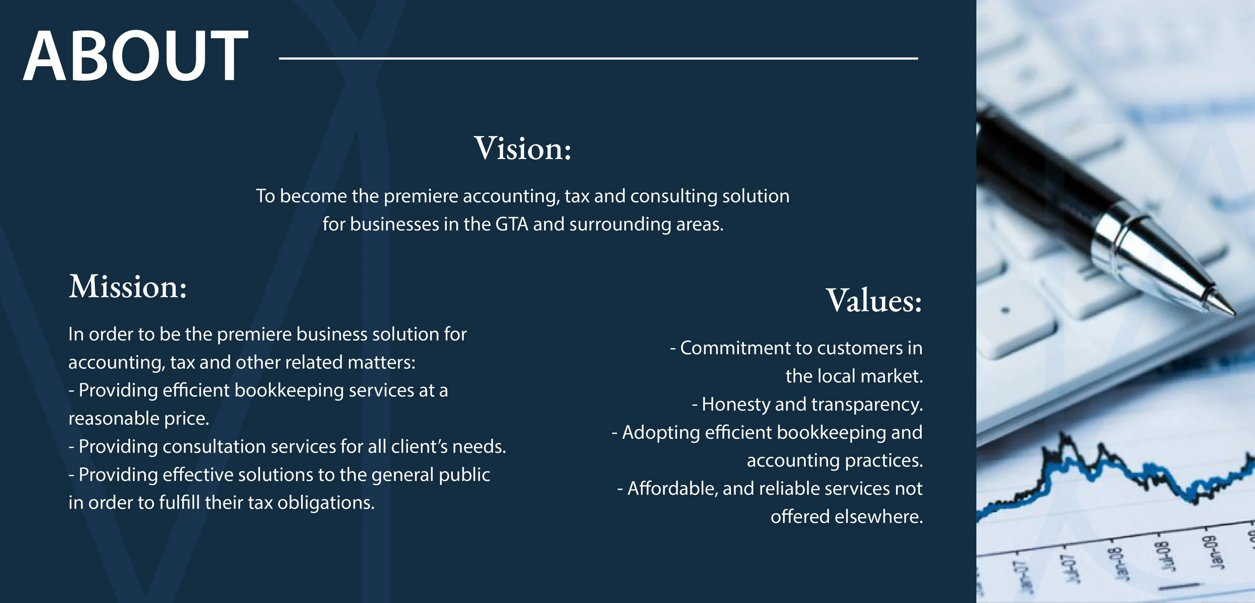
U.D. Accounting is an accounting business that aims to become the premiere accounting, tax and consulting solution for small to medium sized businesses.
Create a brand identity that represents the brand’s goals and vision.
Solution -
The goal was to develop a strong brand for a business in the financial industry. It was important to convey their goals and vision with strong messaging through the design of logo and brand elements.

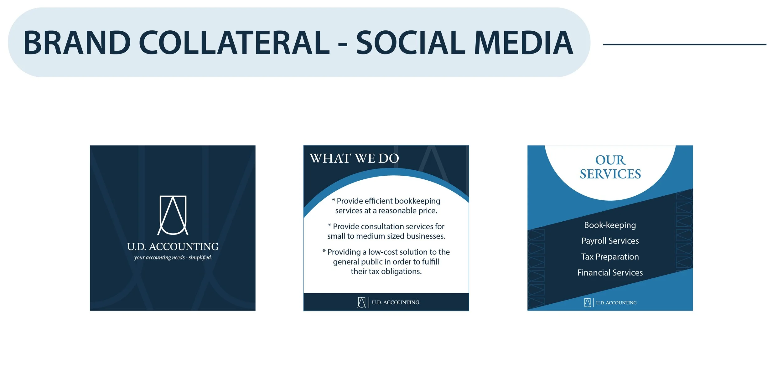
The color palette is comprised of various shades of blue. Blue is used to in many well established businesses as it helps to convey trust, reliability, commitment and honesty.
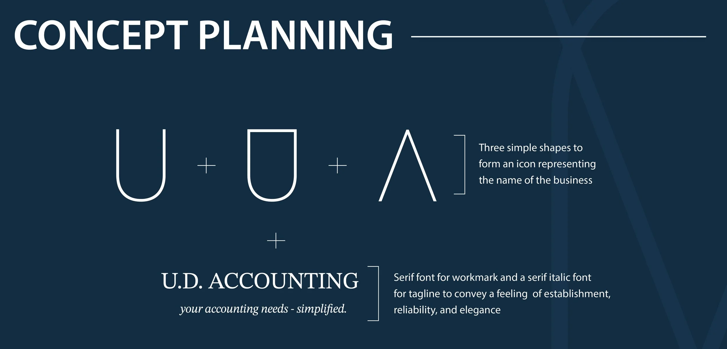
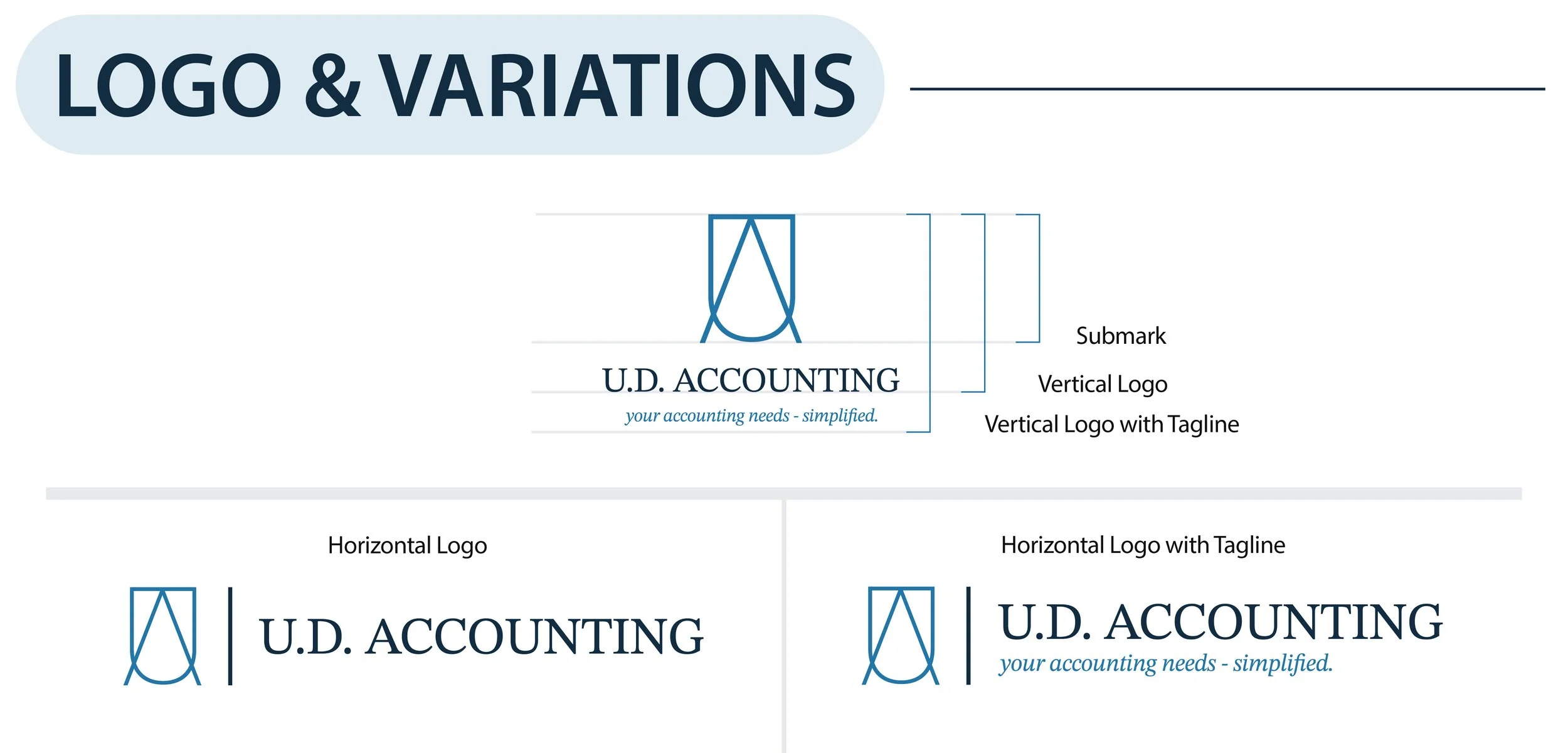
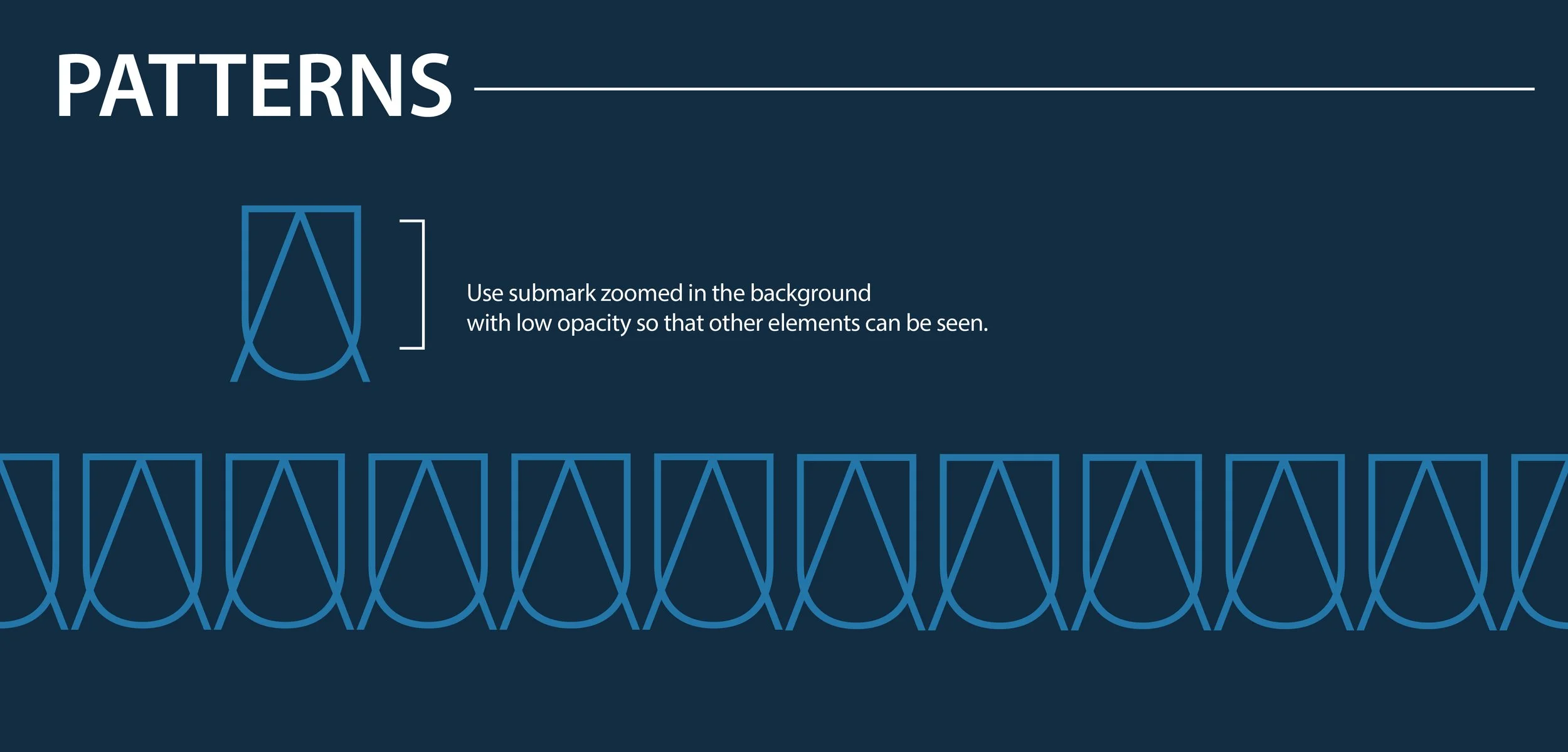
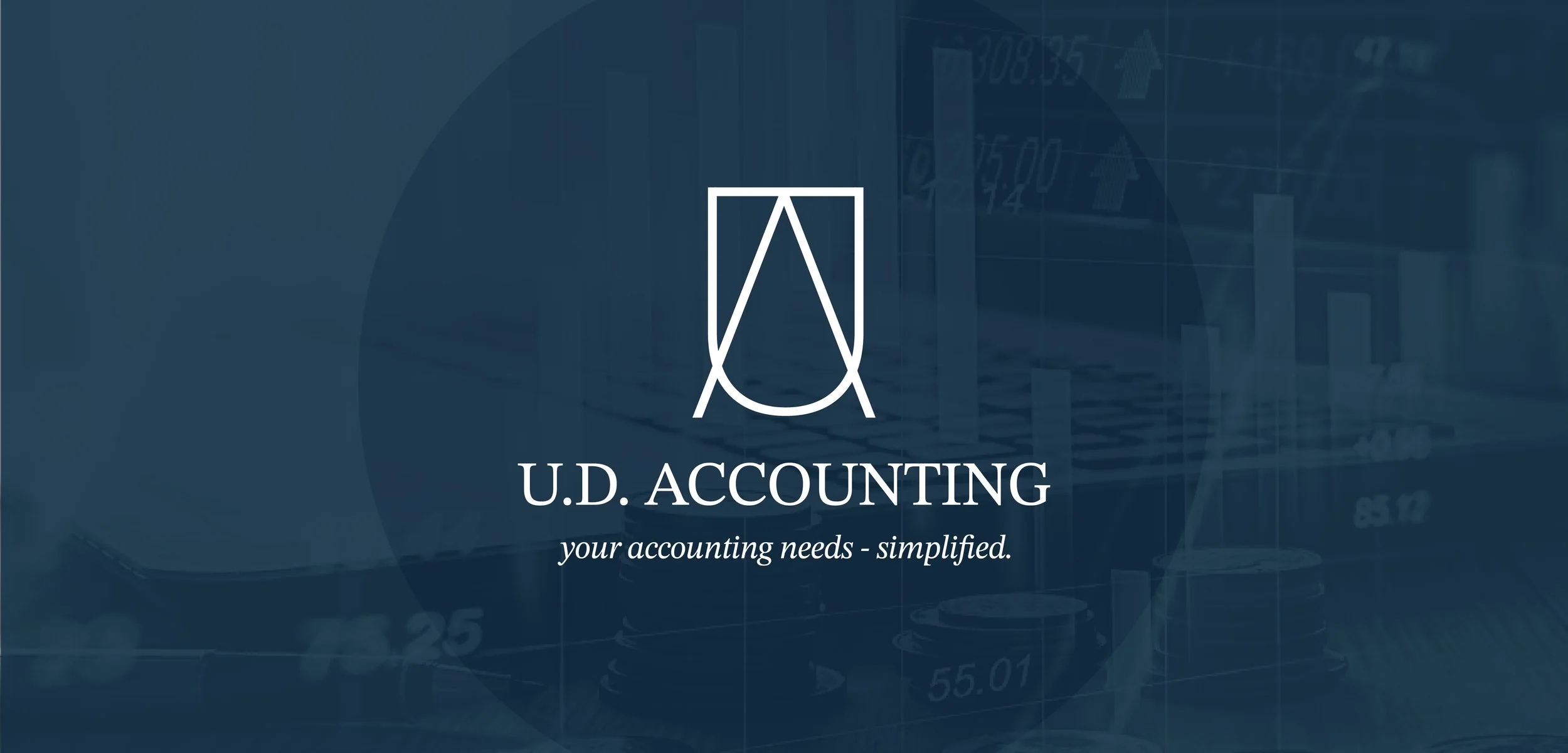
The logo uses three simple shapes to form an icon representing the name of the business. It is paired with a serif font for the name and a serif italic font for the tagline; serif fonts convey a feeling of establishment, reliability, and elegance.

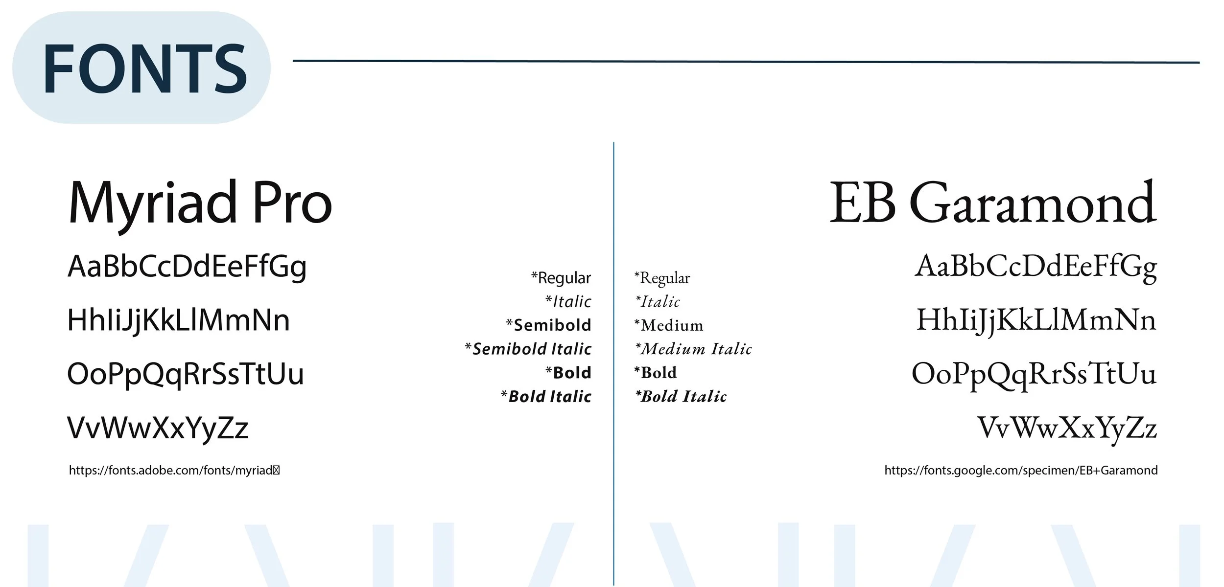
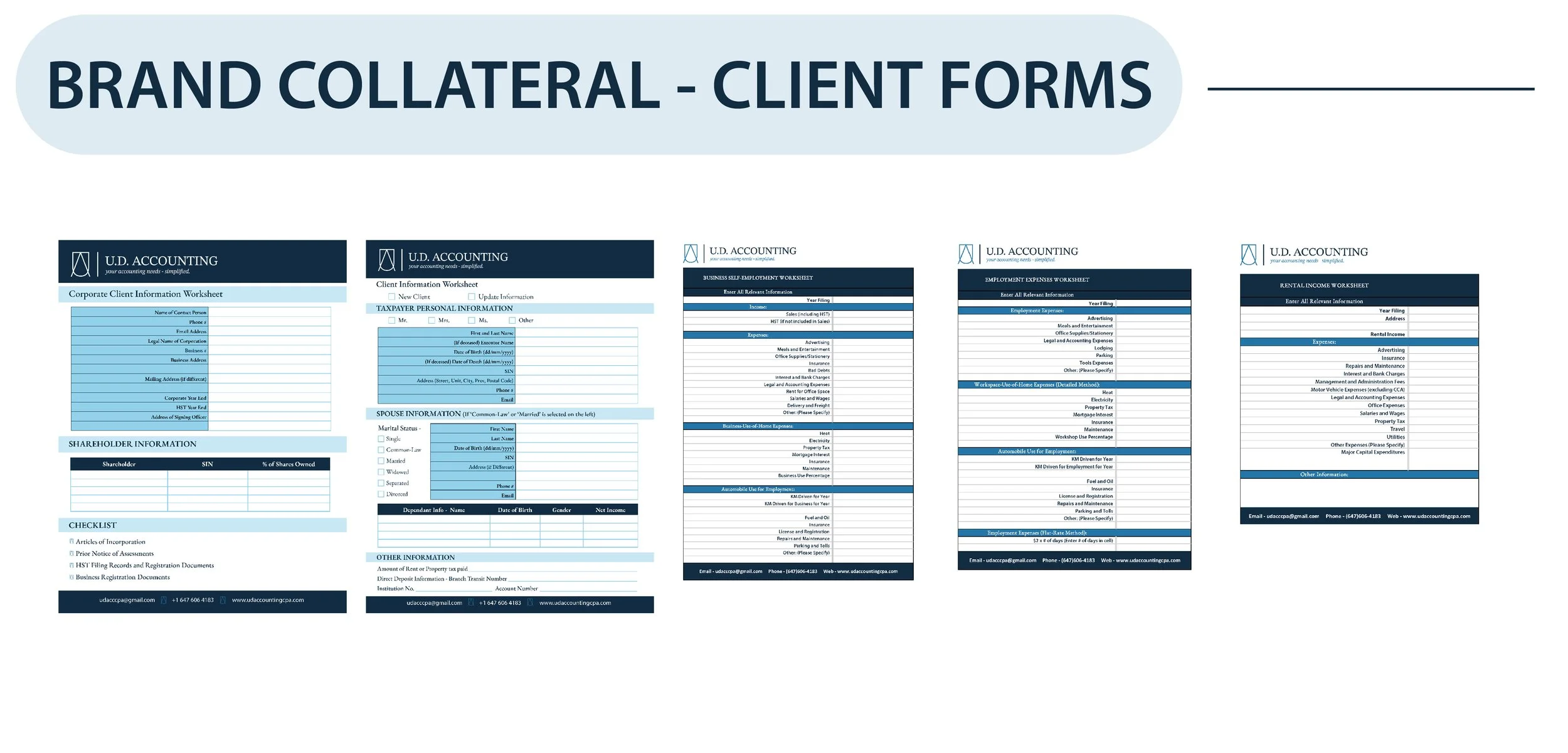
The font chosen is a sans serif font and a serif font. The sans serif font conveys the modern and welcoming nature of the business and the serif font represents professionalism, and establishment.
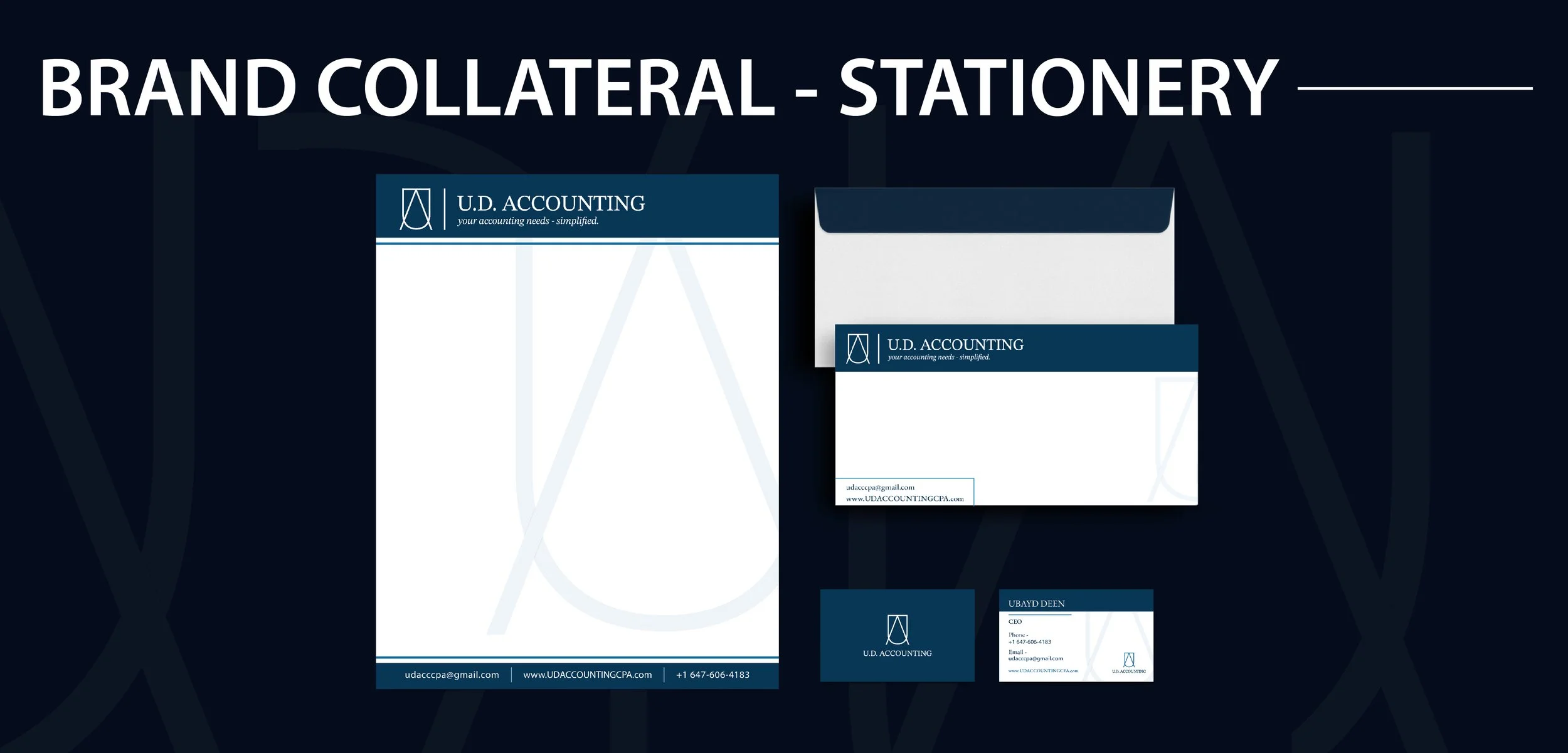
The stationery items are designed with the dark blue and white color combination in order to help the horizontal logo and text stand out from the background in all of the stationery designs. The font and color usage in the stationery items are also consistent and cohesive.
Website
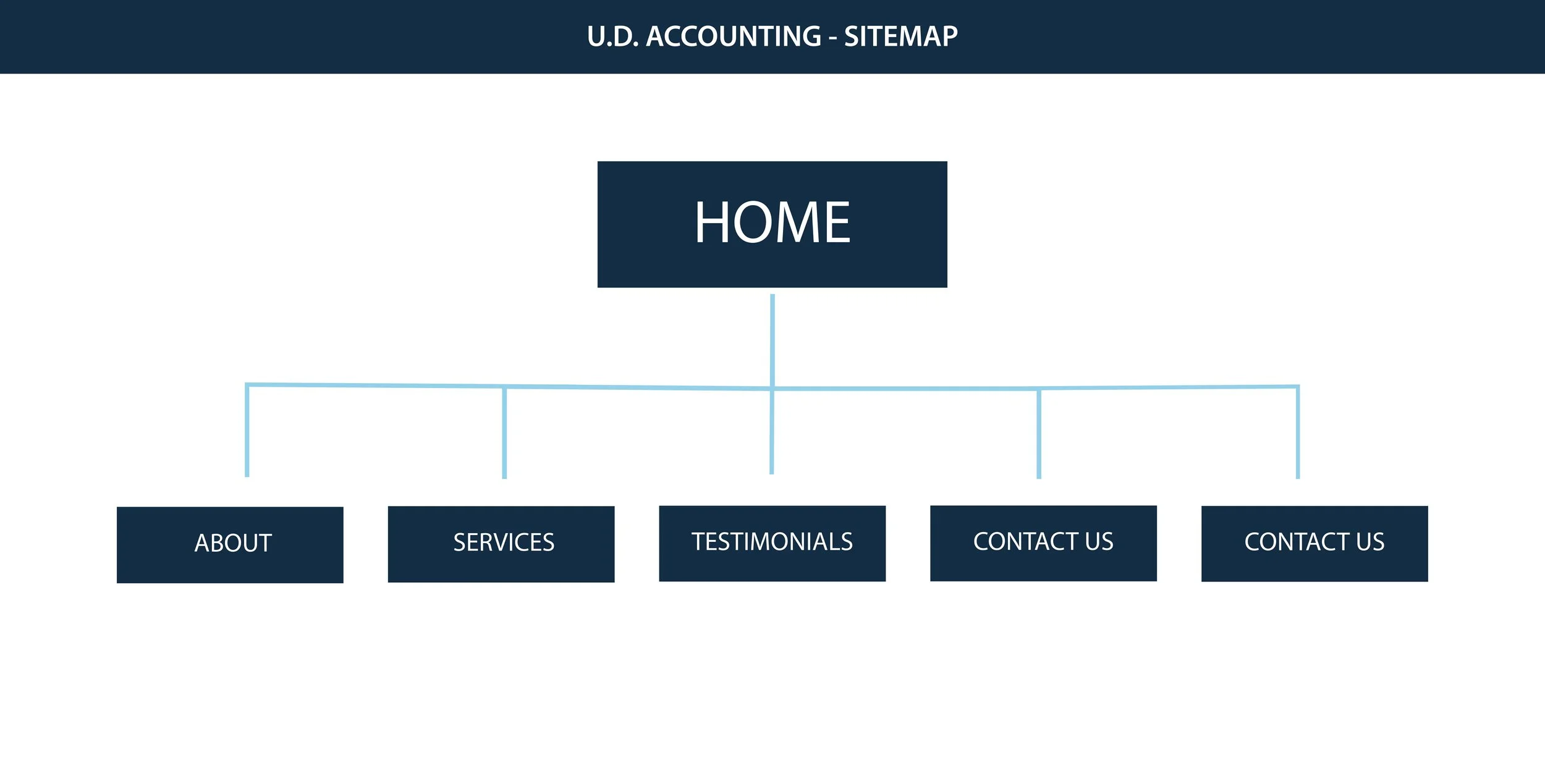
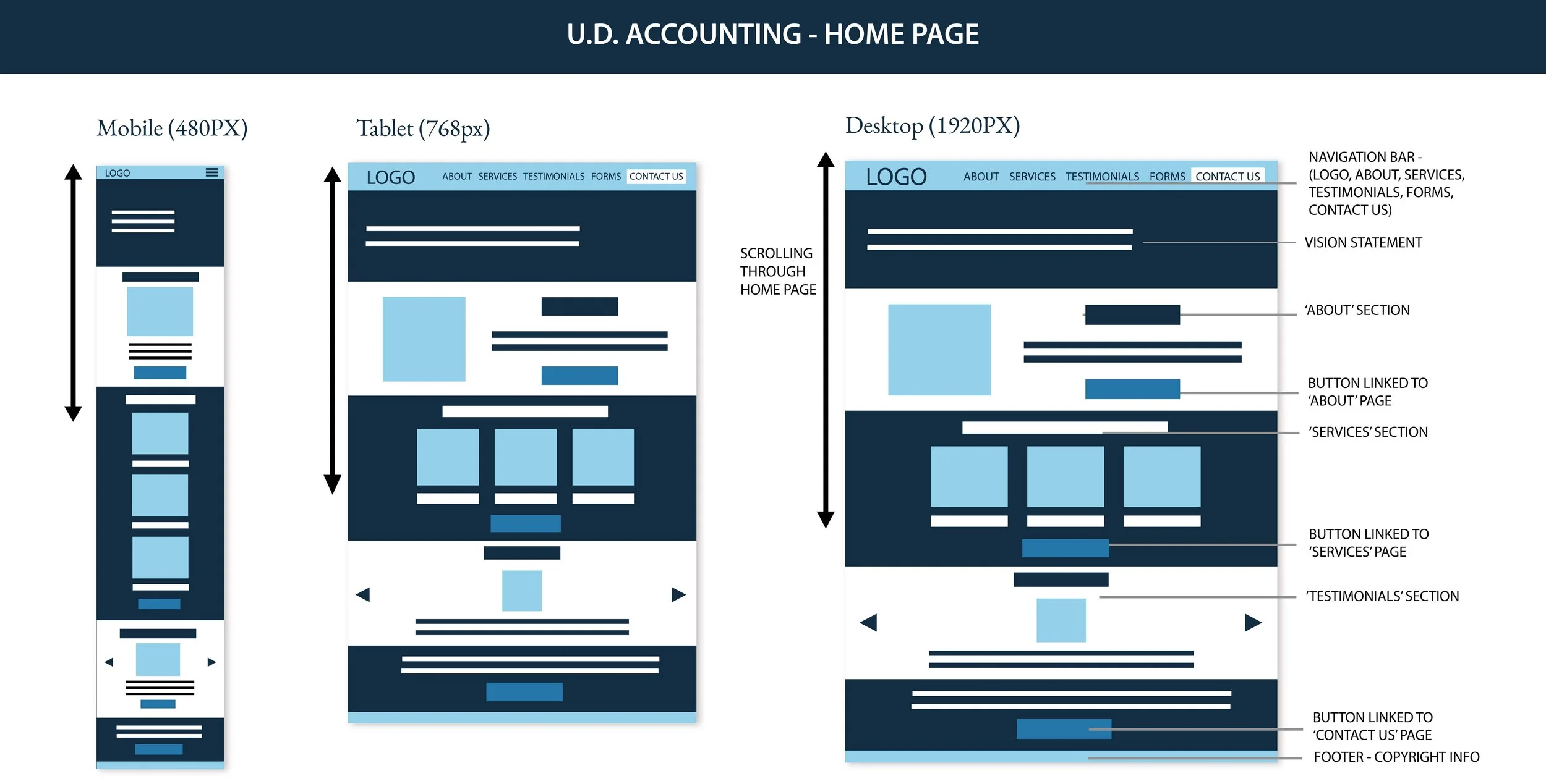
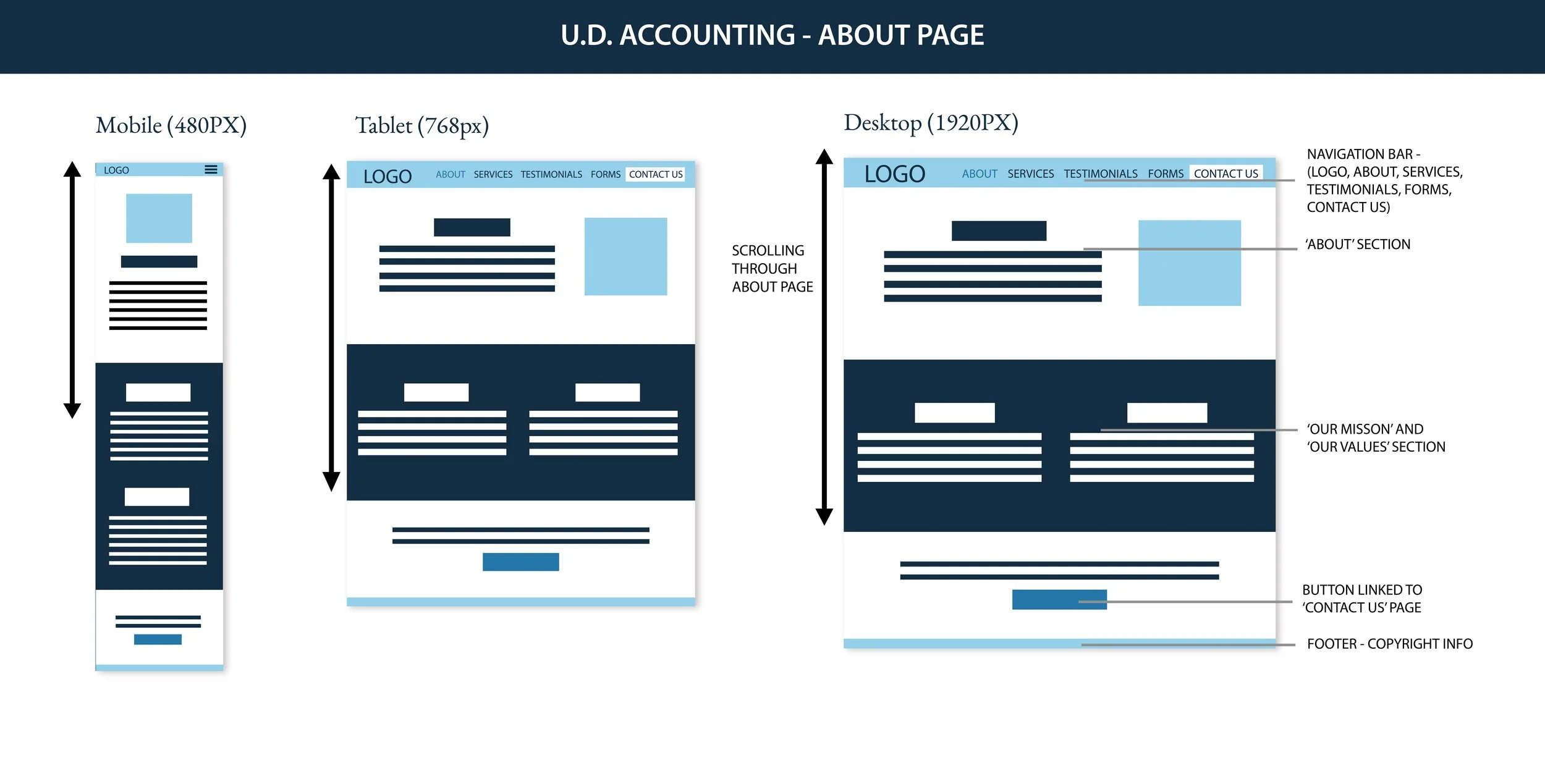
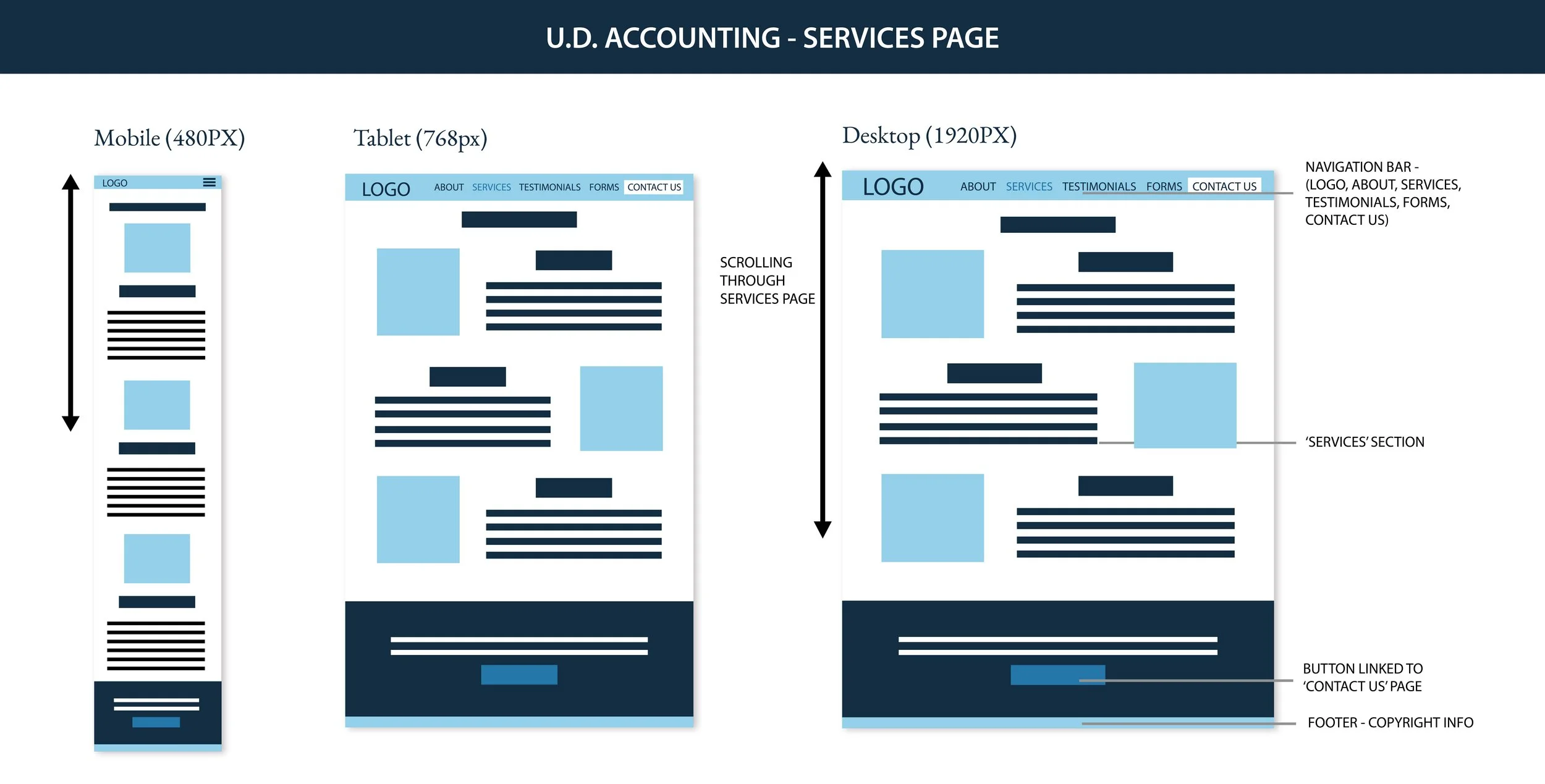
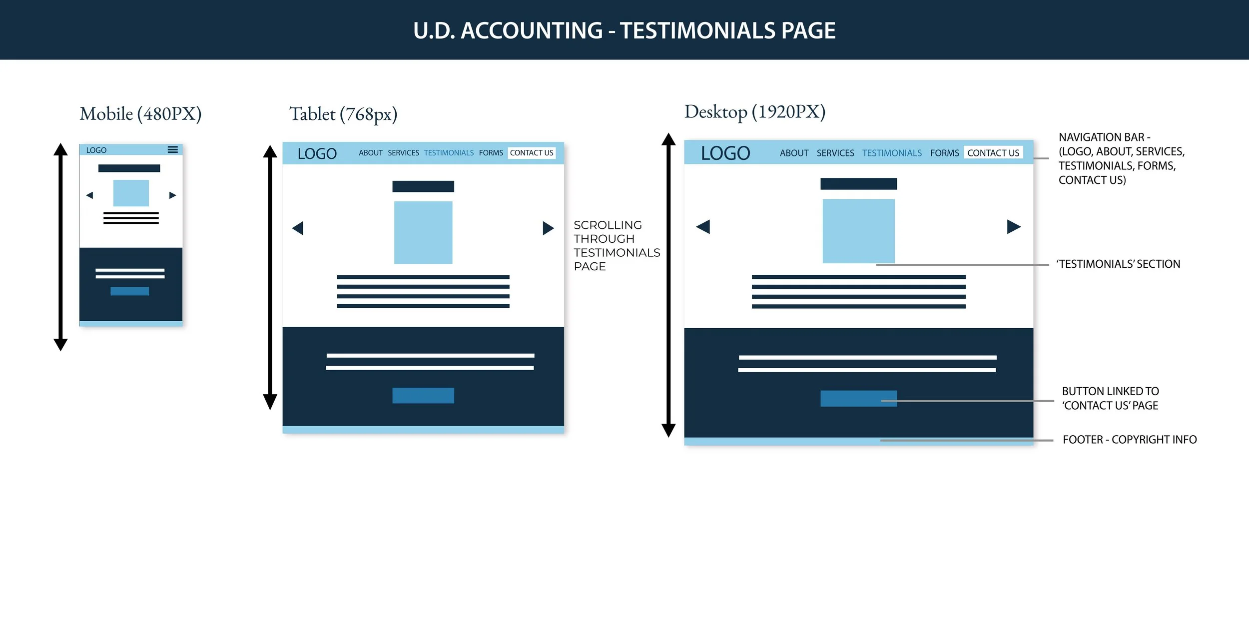
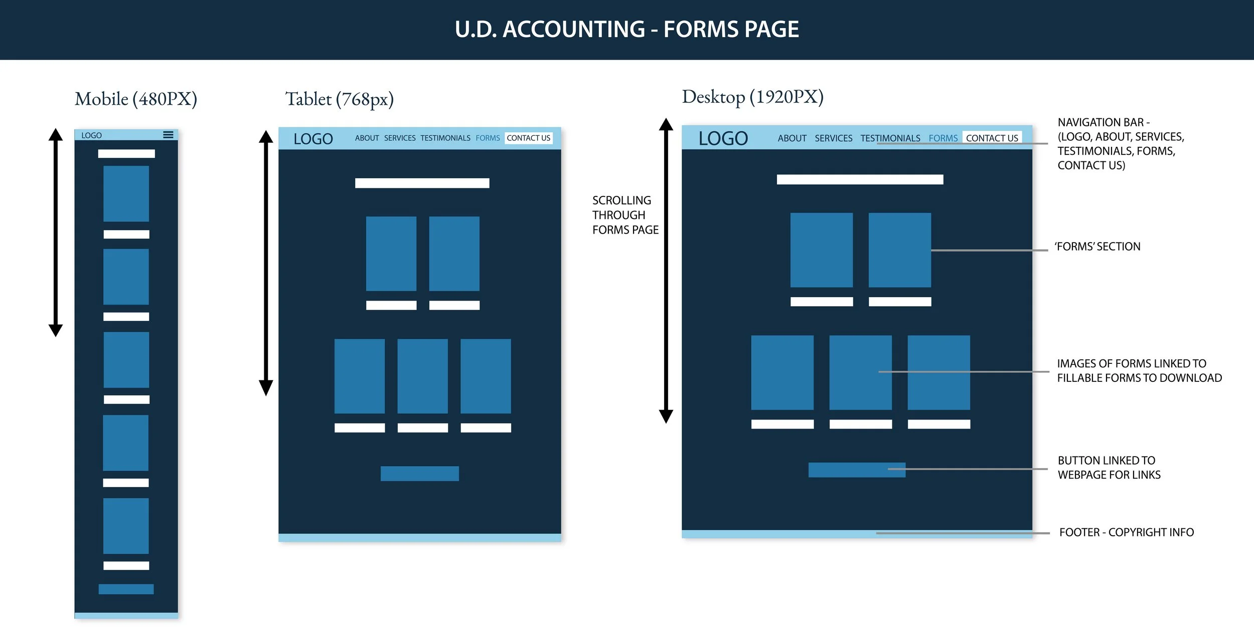
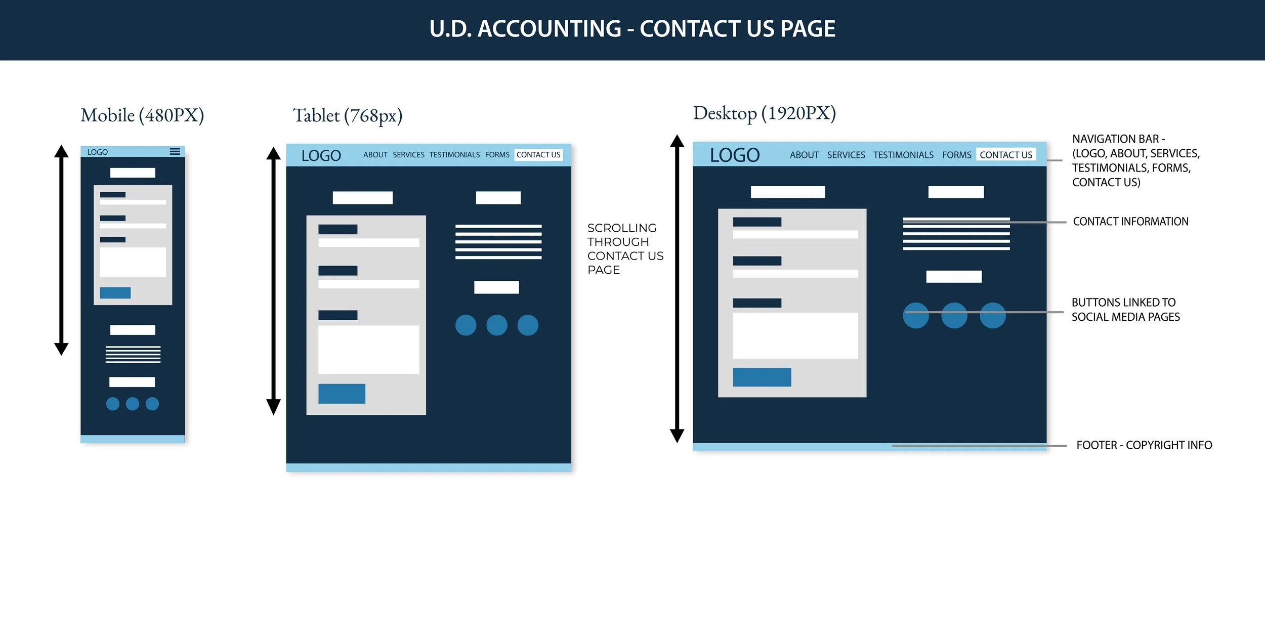
The process of creating the website involved thorough discussions with the client on what information was needed and how it was going to be structured in an effective and organized manner. The main goal of the website is to be responsive (compatible on mobile, tablet and desktop), minimal in design and content, and has smooth user navigation.
In the wireframes the structure of content is different for the mobile, tablet, and desktop. There are breakpoints that are inserted so that the content will not be crowded on smaller screens; this will enable users to scroll through and see all the images and buttons and interact with them without any issues. The website also follows the brand style guide and is consistent with font and color usage and messaging throughout all pages.
The final logo design and brand elements are used on all brand collateral and the elements of the brand strongly come together as one unit.