T4 TEA - Brand Identity
Project Type -
Client Project
Client -
Abdulmohsen Al Hendal
(Owner - T4 TEA)
Date -
May 2024
Scope -
Brand Identity
Packaging
Menu Design
Software -
Adobe Illustrator
Adobe Photoshop
Brief -
T4 TEA is a tea shop importing organic tea from Sri Lanka. The business needed a strong brand identity and packaging design to -
Attract their target audience (young to Middle-aged Adults from ages 25-45 with high income, looking to indulge in premium, health-oriented products and people who enjoy cultural and social gatherings - a significant aspect of Kuwaiti culture where coffee and tea are served).
Convey their vision (To bridge nature with rituals and routine that emphasizes rest and relaxation).
Highlight their unique selling point (unique tea colors and distinctive aromas)
Solution -
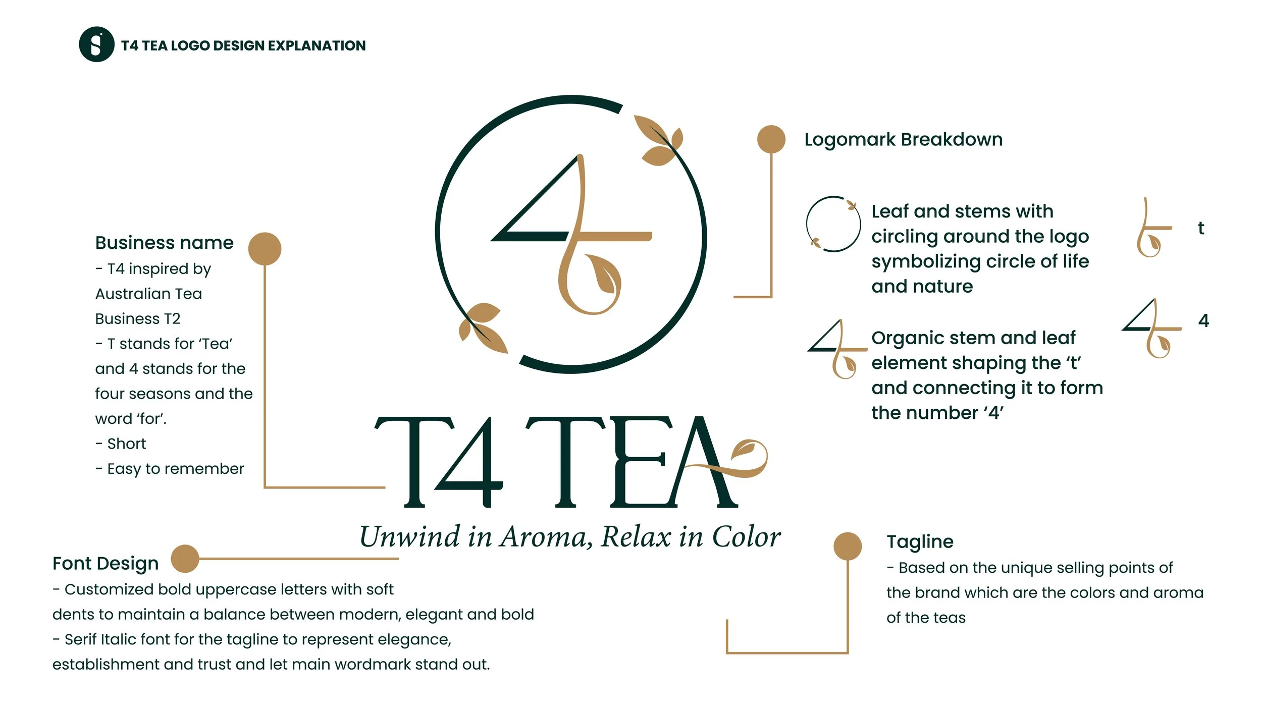
The goal was to develop a strong brand for a business in the tea industry. It was important to understand and convey their goals and vision with strong messaging through the design of logo and brand elements (i.e.- the packaging).

——->
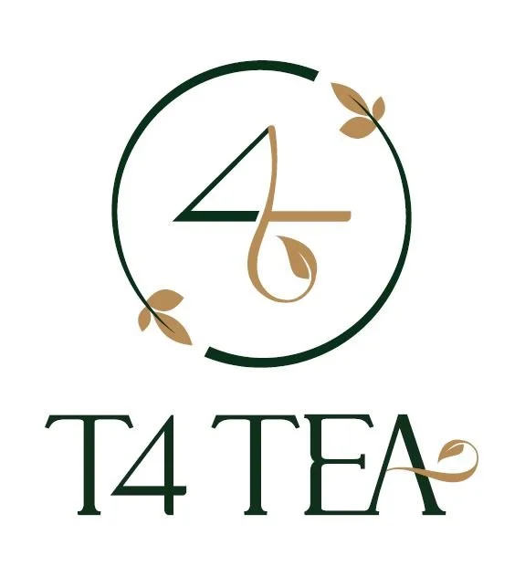
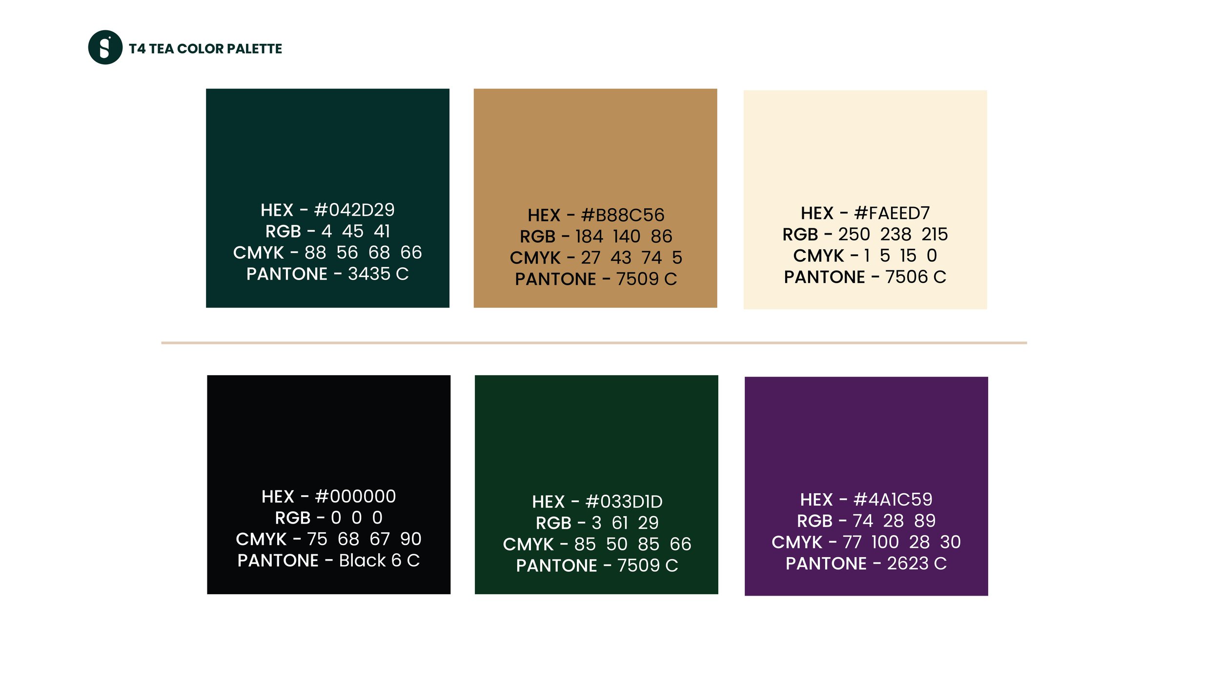
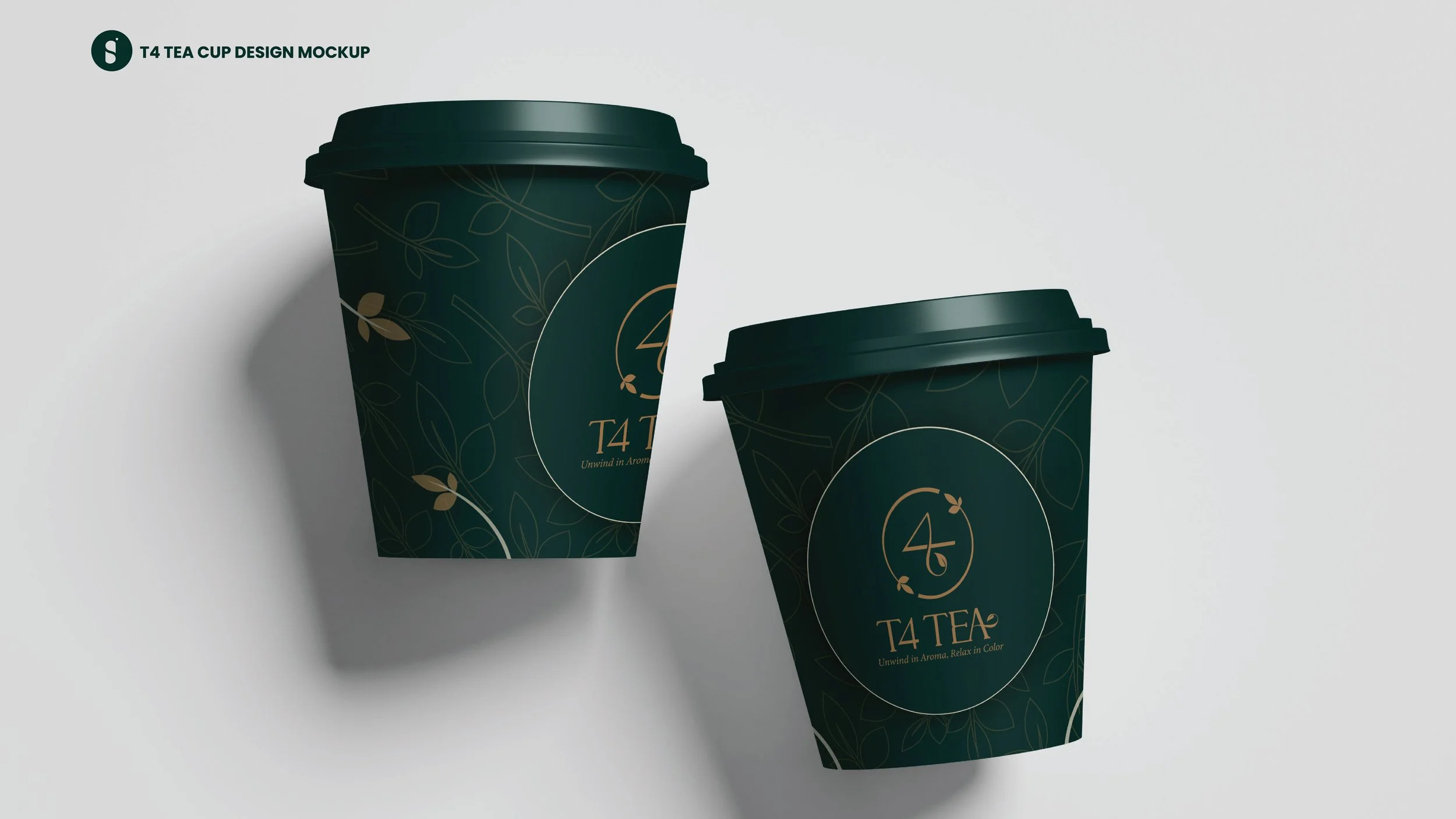
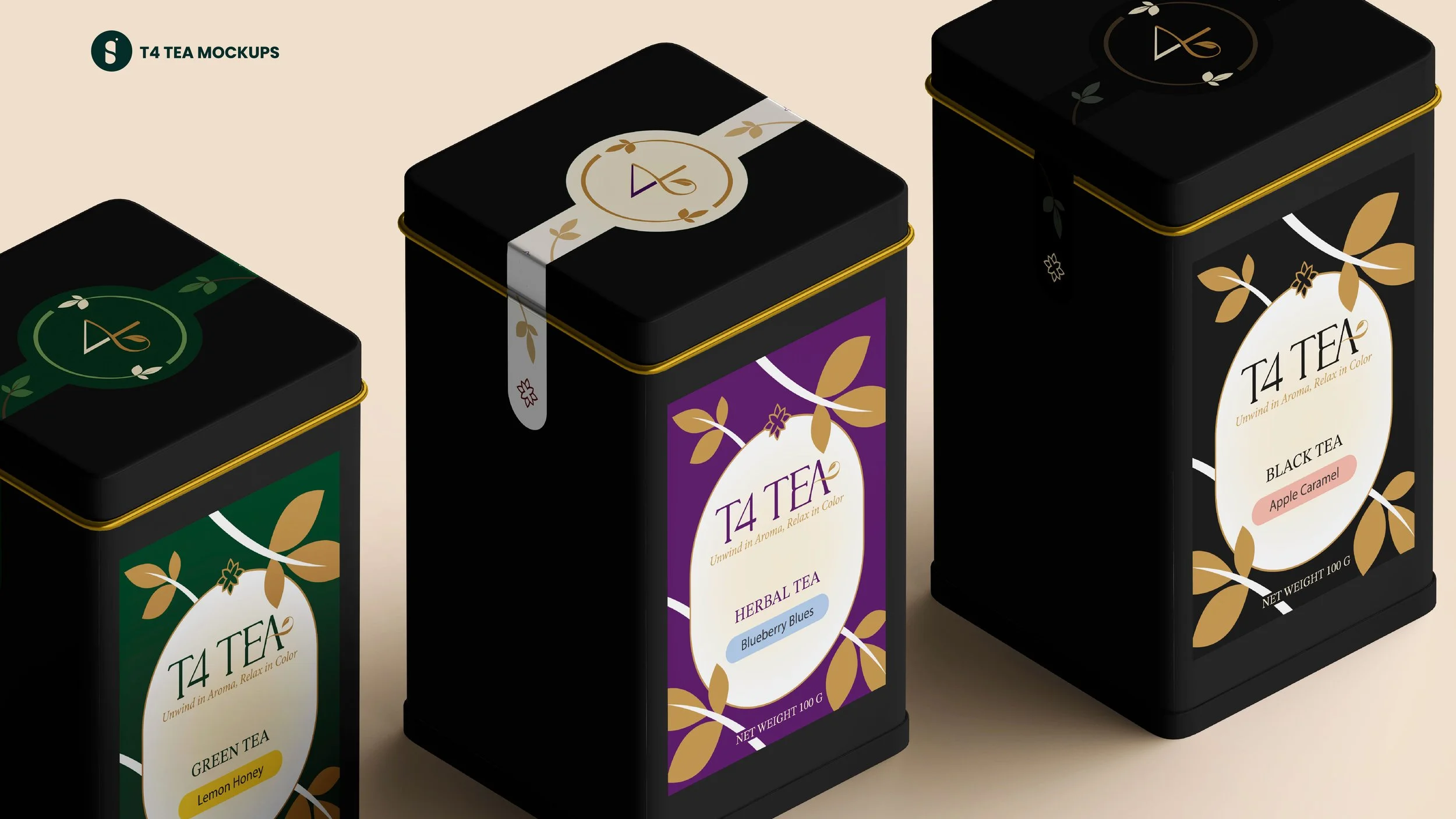
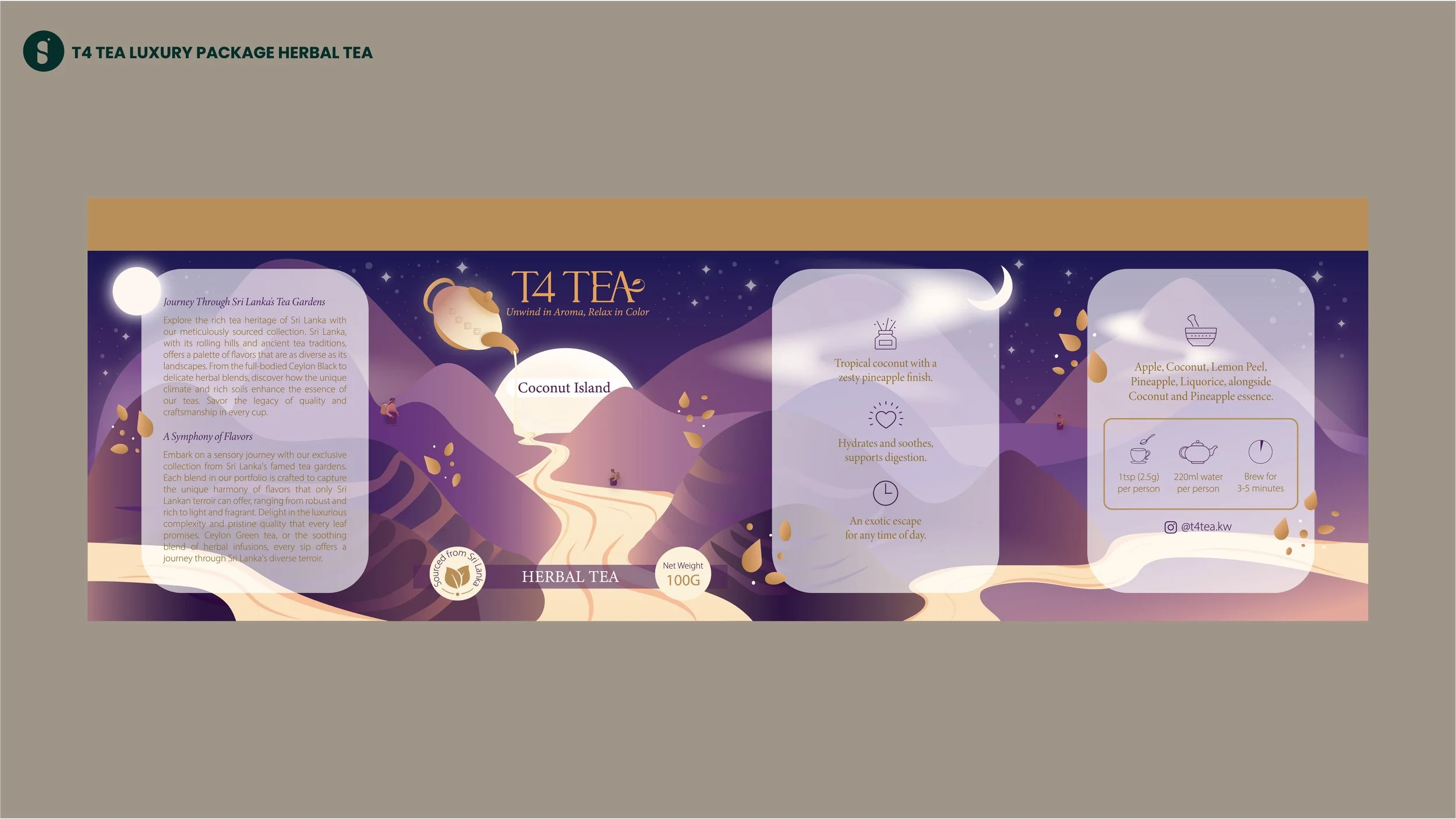
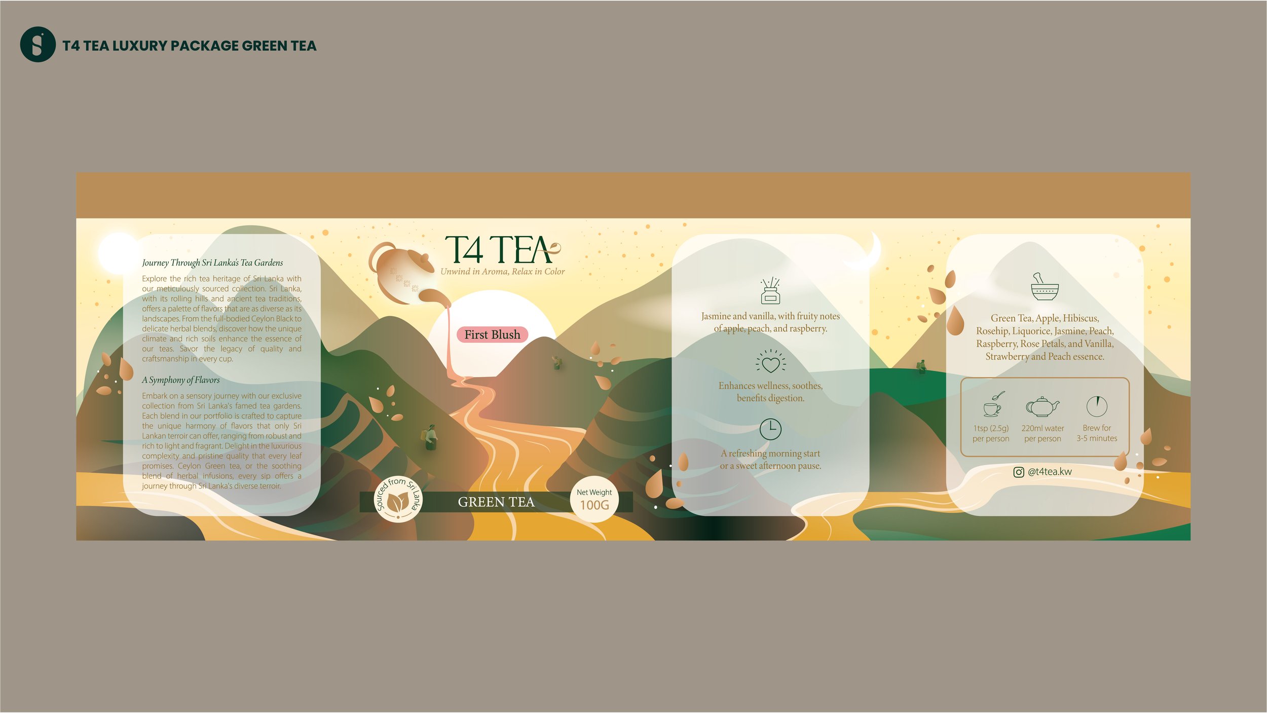
The primary color palette for the brand is comprised of dark green (to represent nature), gold (to represent luxury and value) and cream (to represent serenity and relaxation). The second set of colors are selected for the three main categories of tea - Black, green, and herbal. Dark, rich colors were chosen for the teas to symbolize the elegant, luxurious and authentic aspects of the brand.
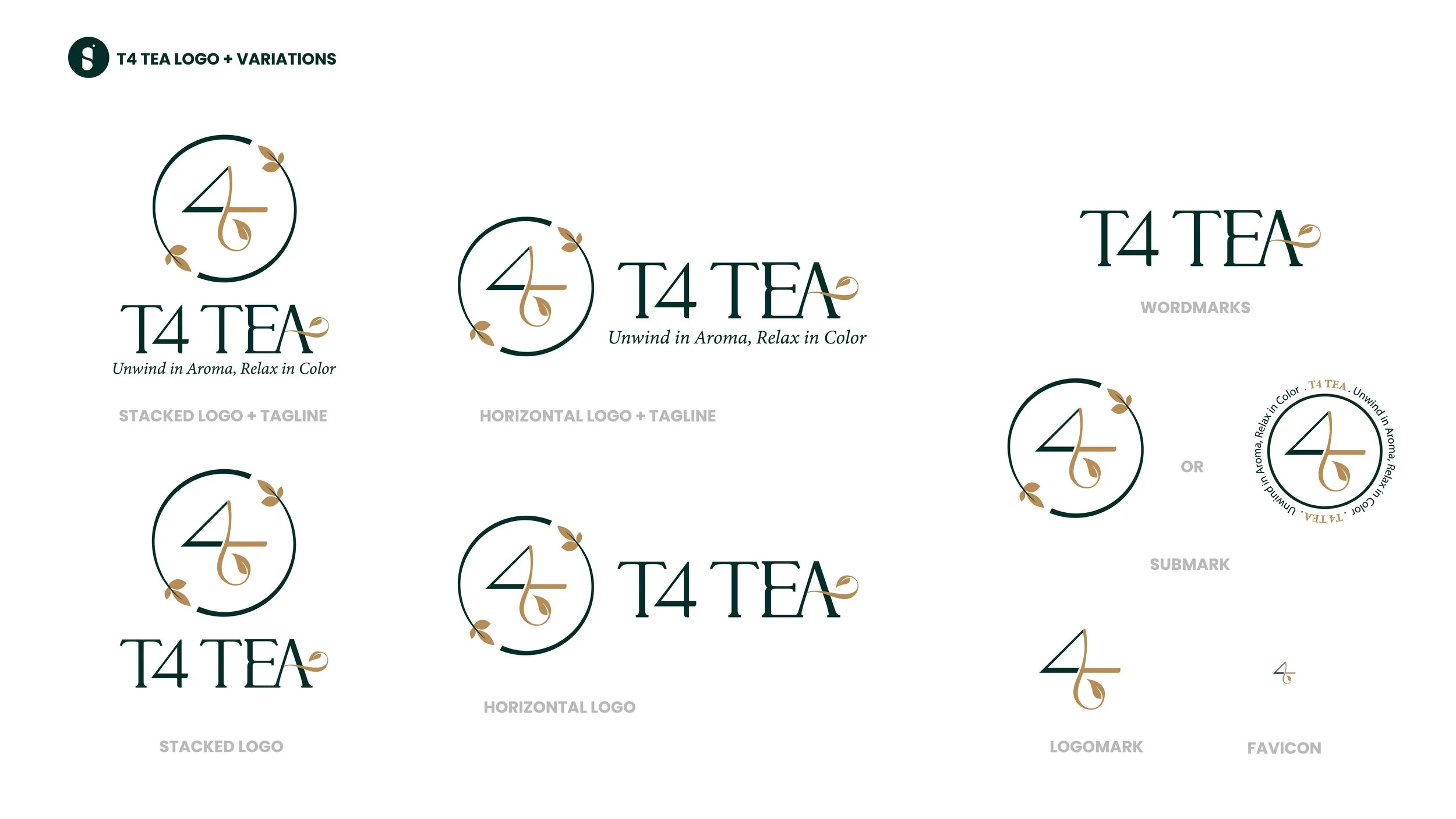
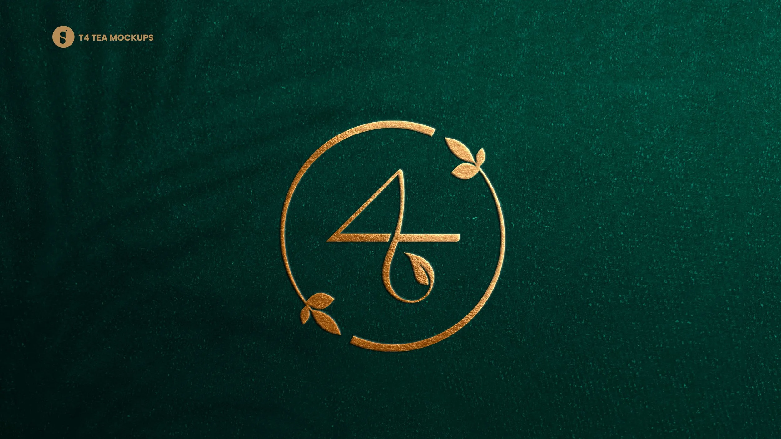
The logo and variations are created so that it can be used across all marketing programs; the variations allow it to be used in different spaces while strongly tying to the brand’s identity.
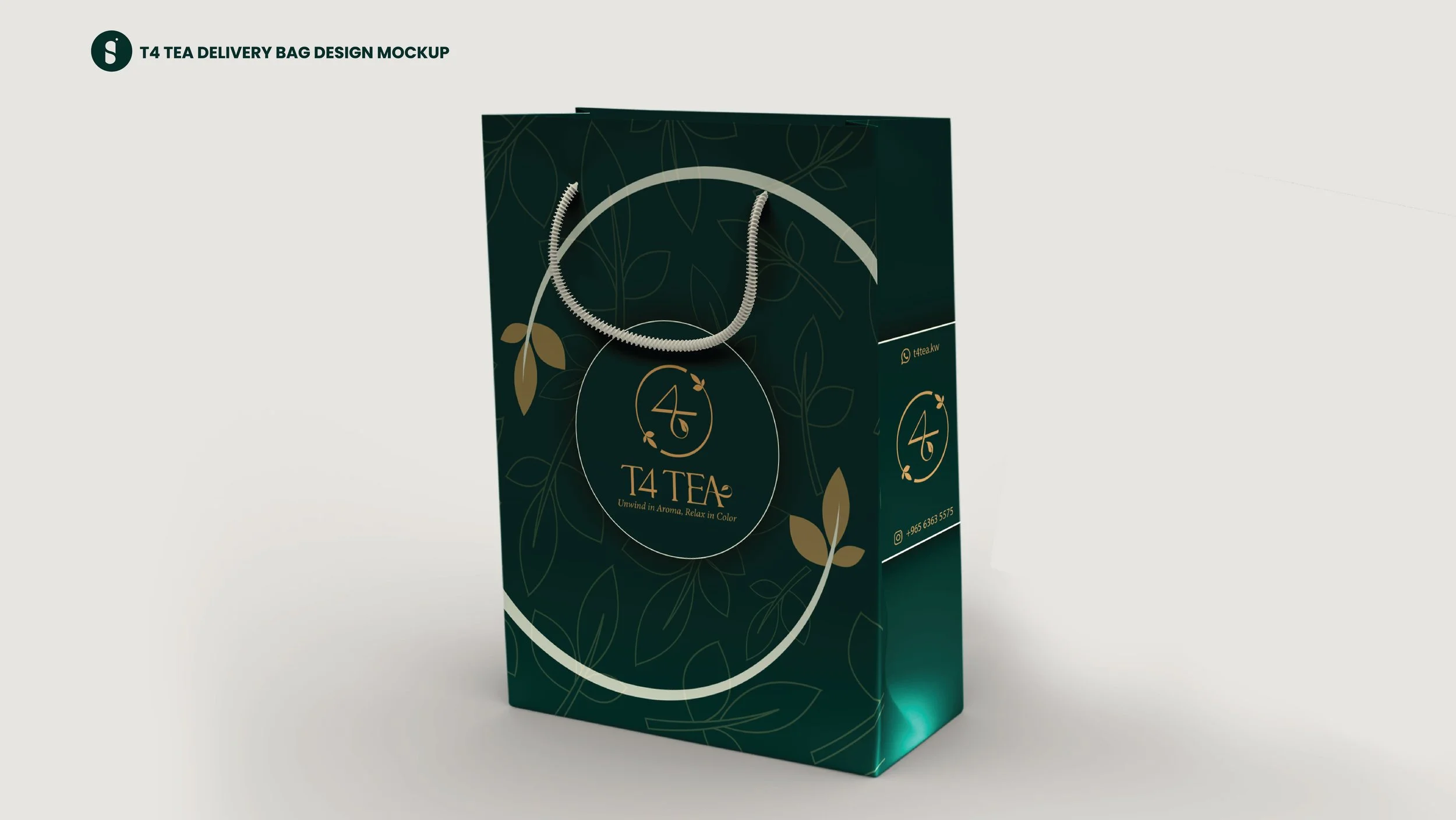
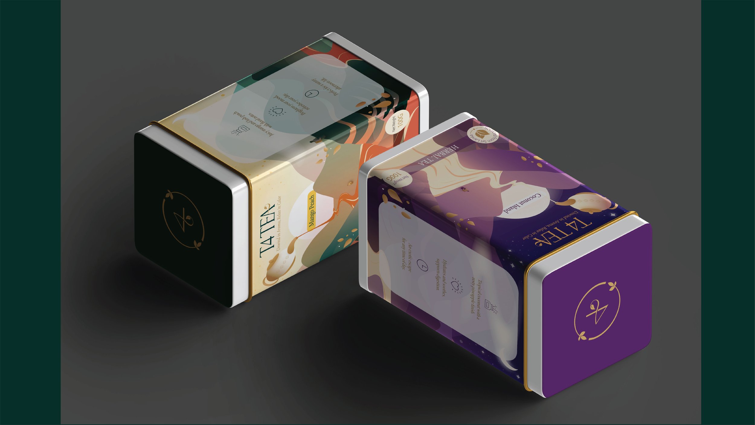
Basic Packaging
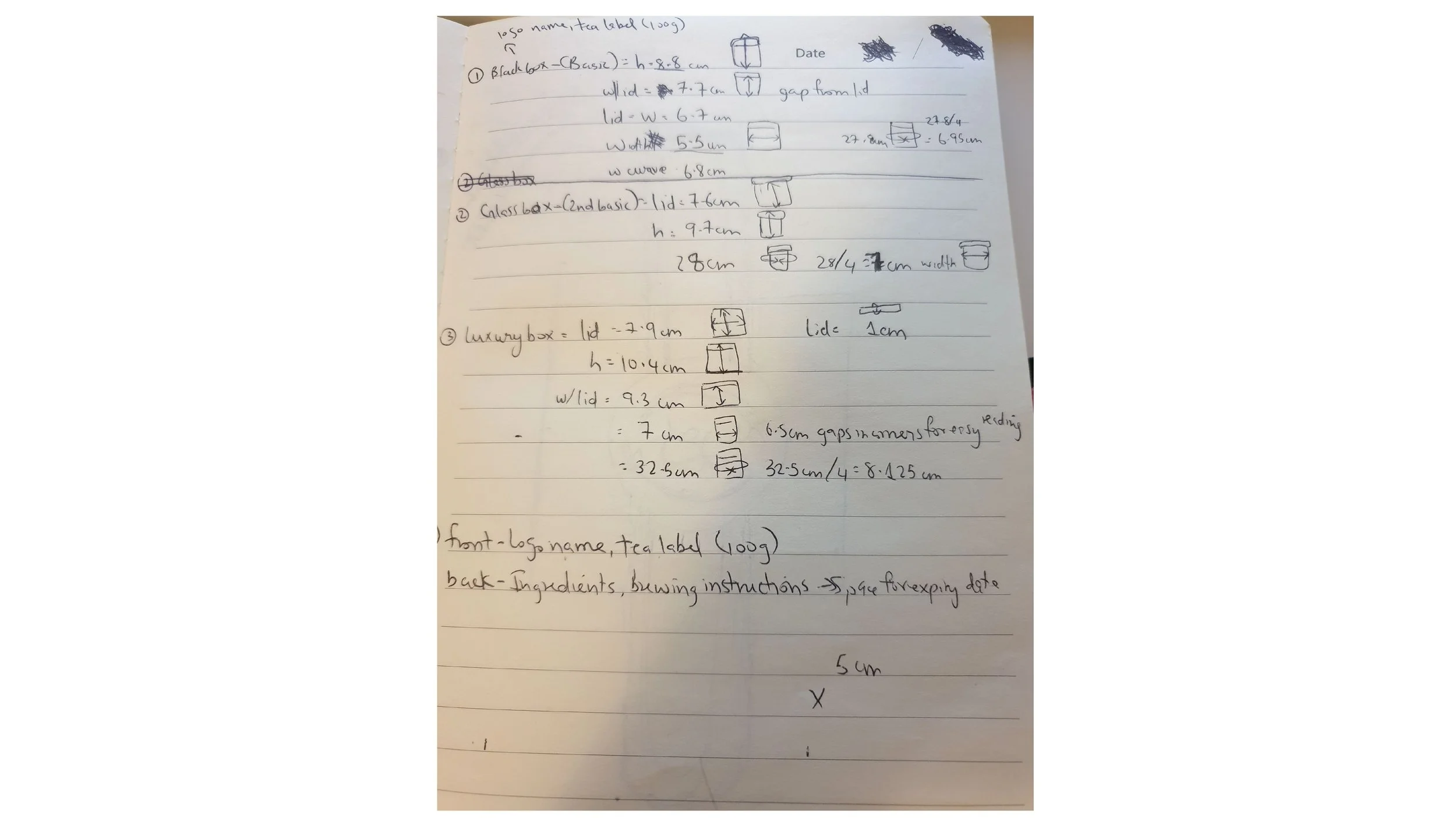
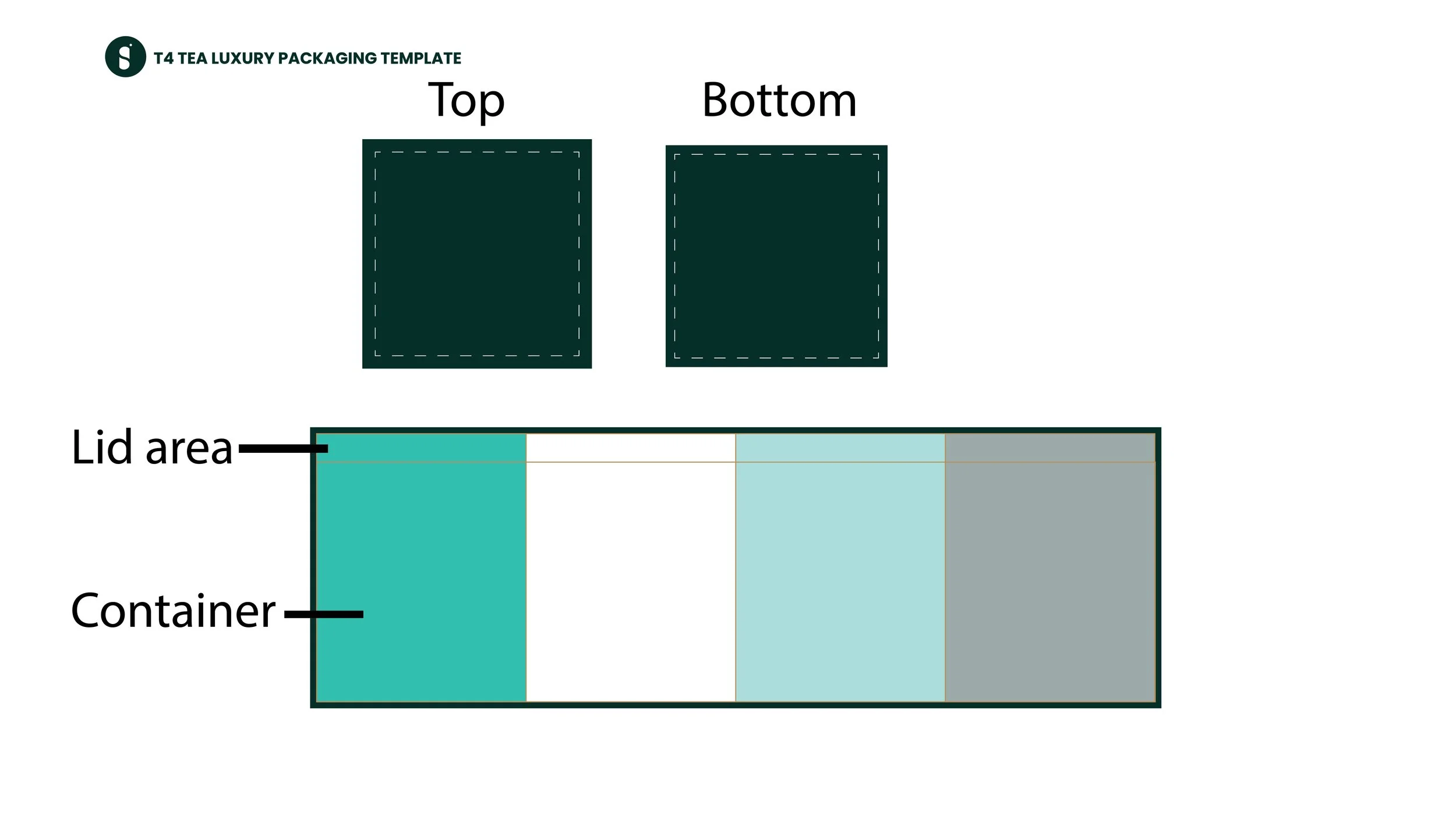
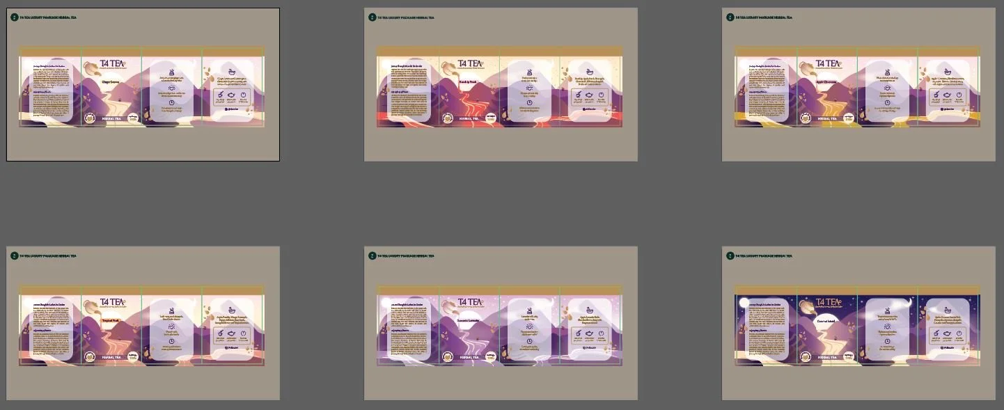
Luxury Packaging Design Process
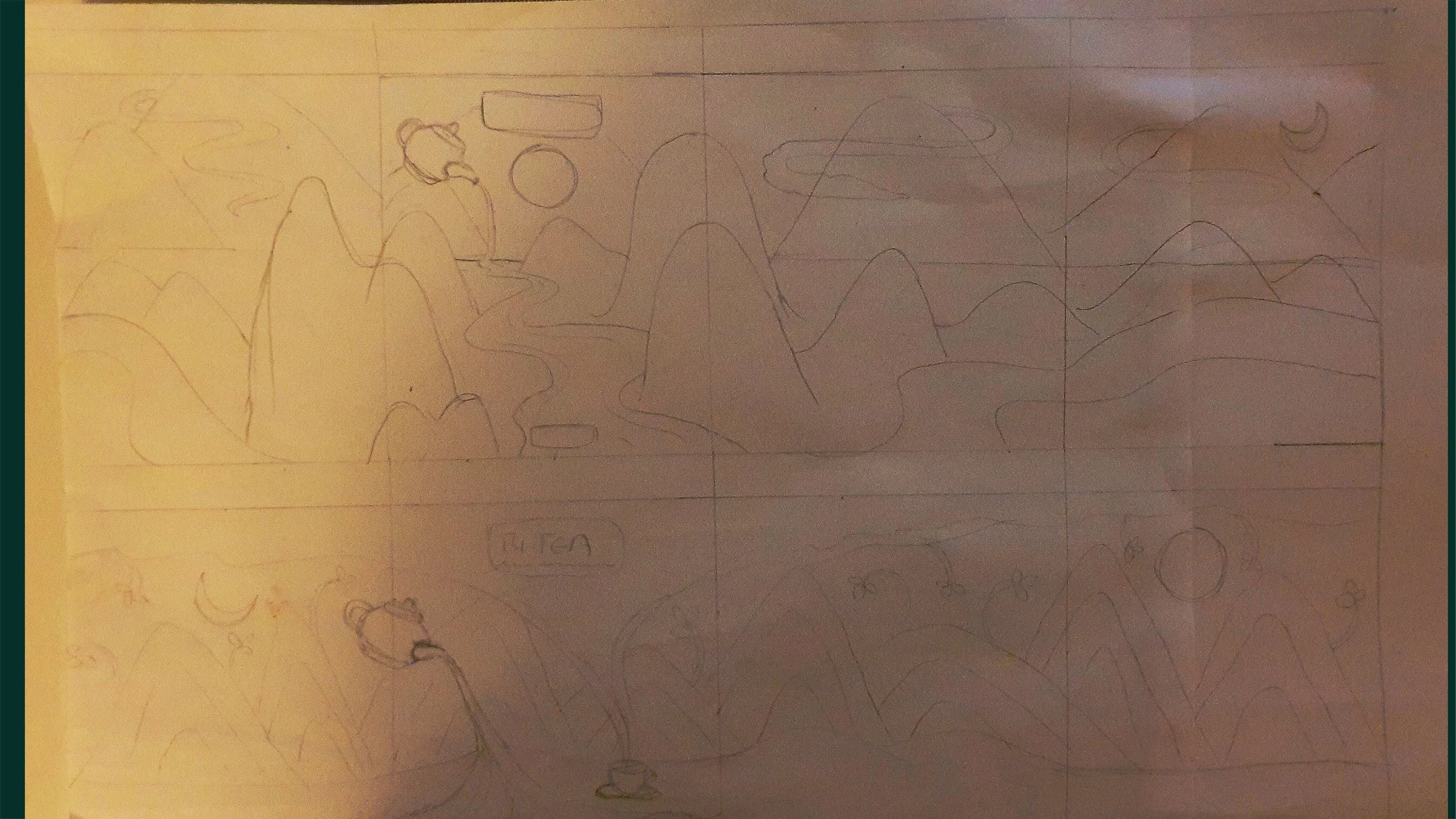
Vectorized Drawing and Color Palette for Herbal, Black and Green Teas
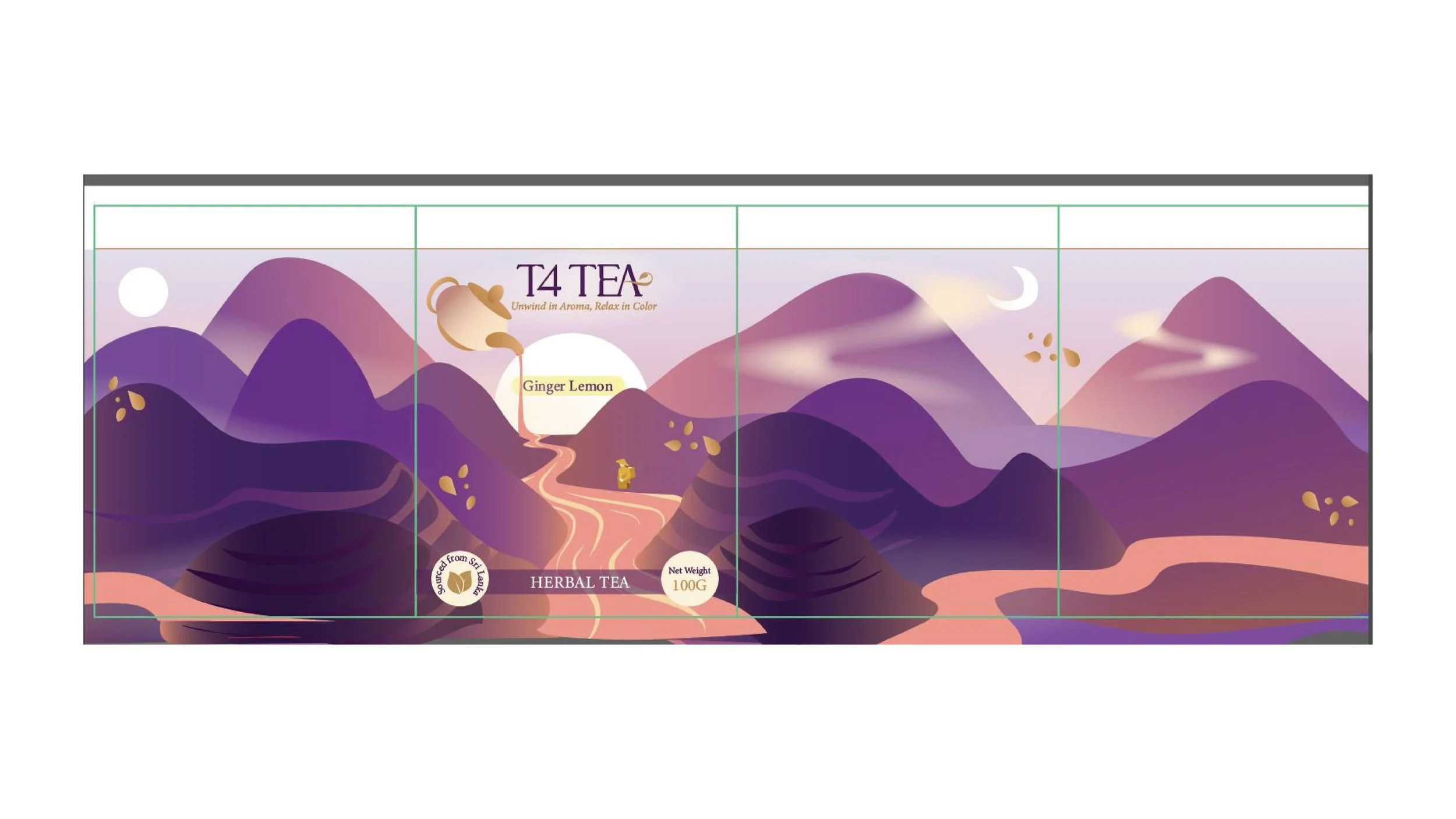
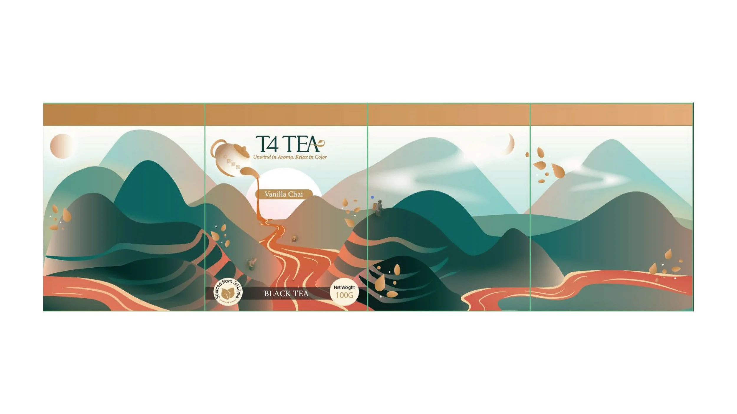
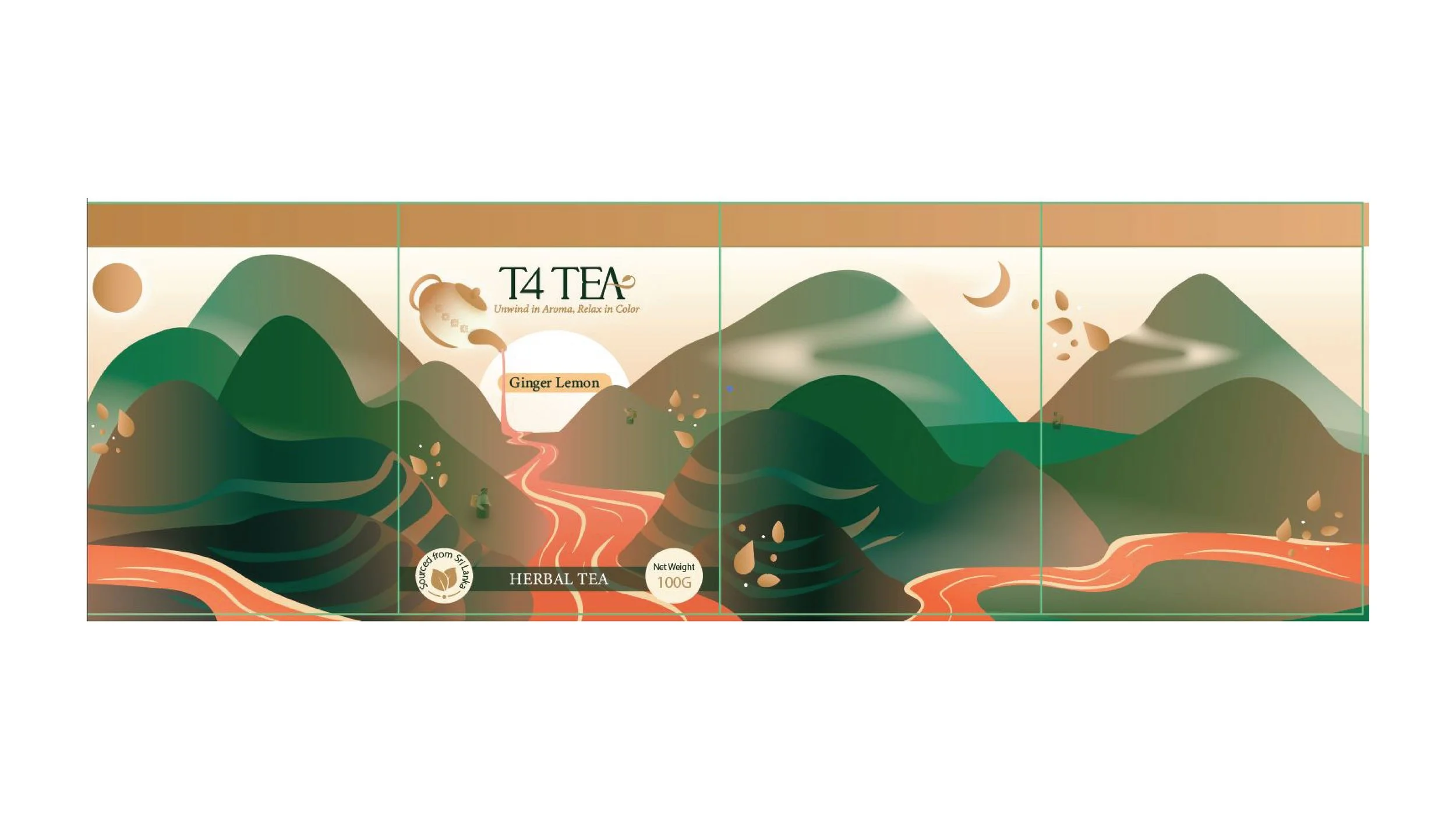
A Few Final Designs after Refinement

Design Breakdown -
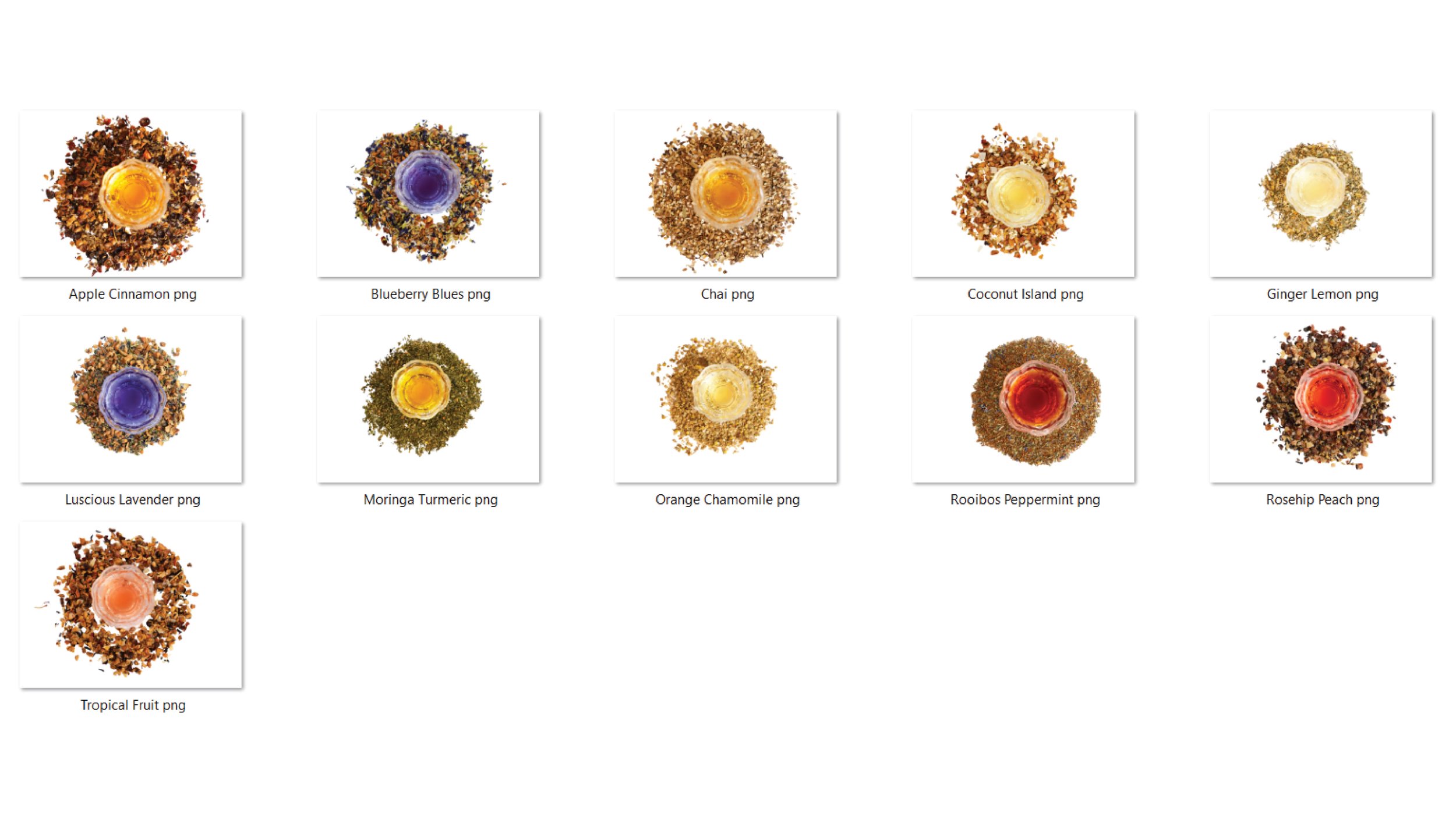
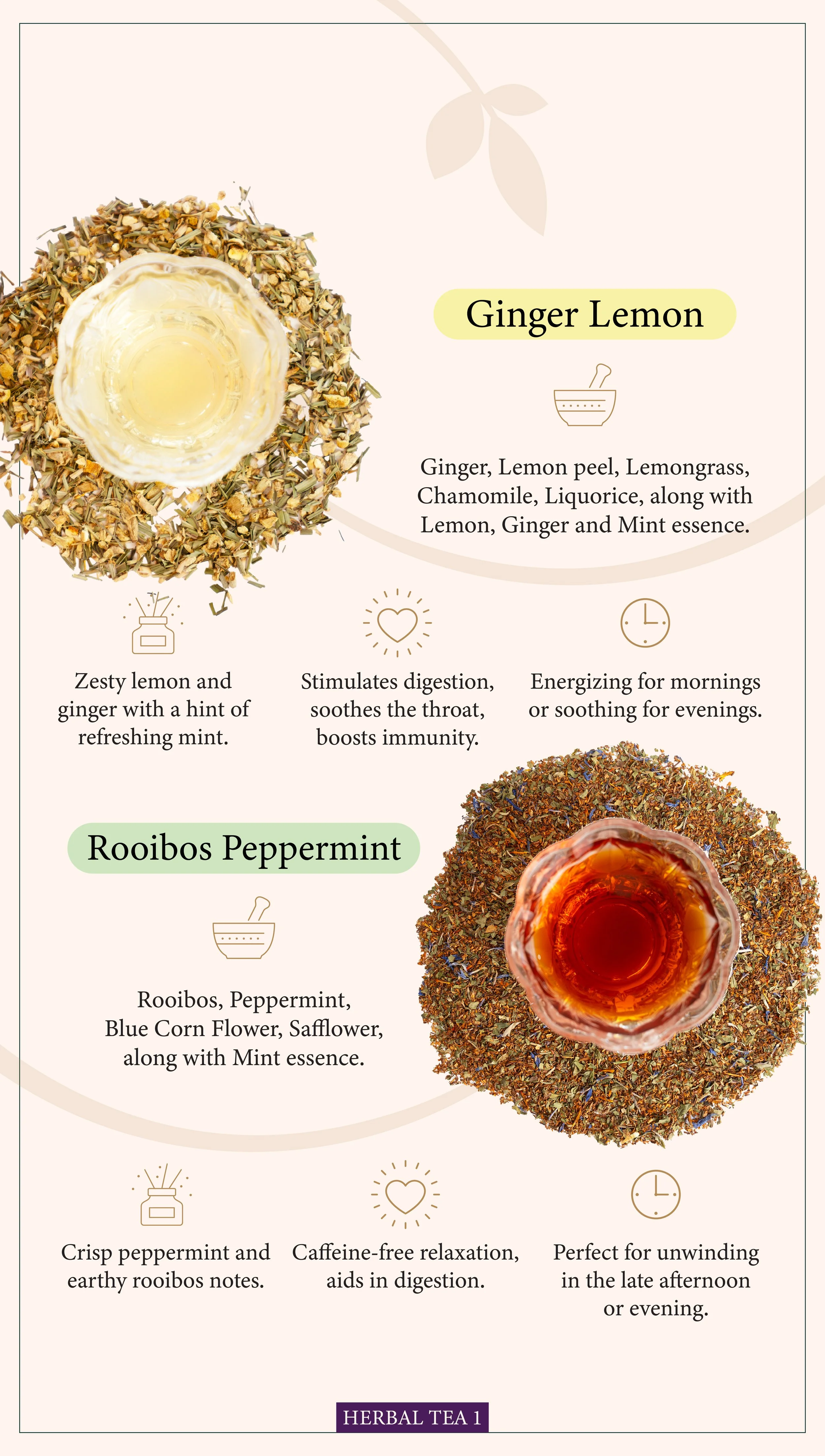
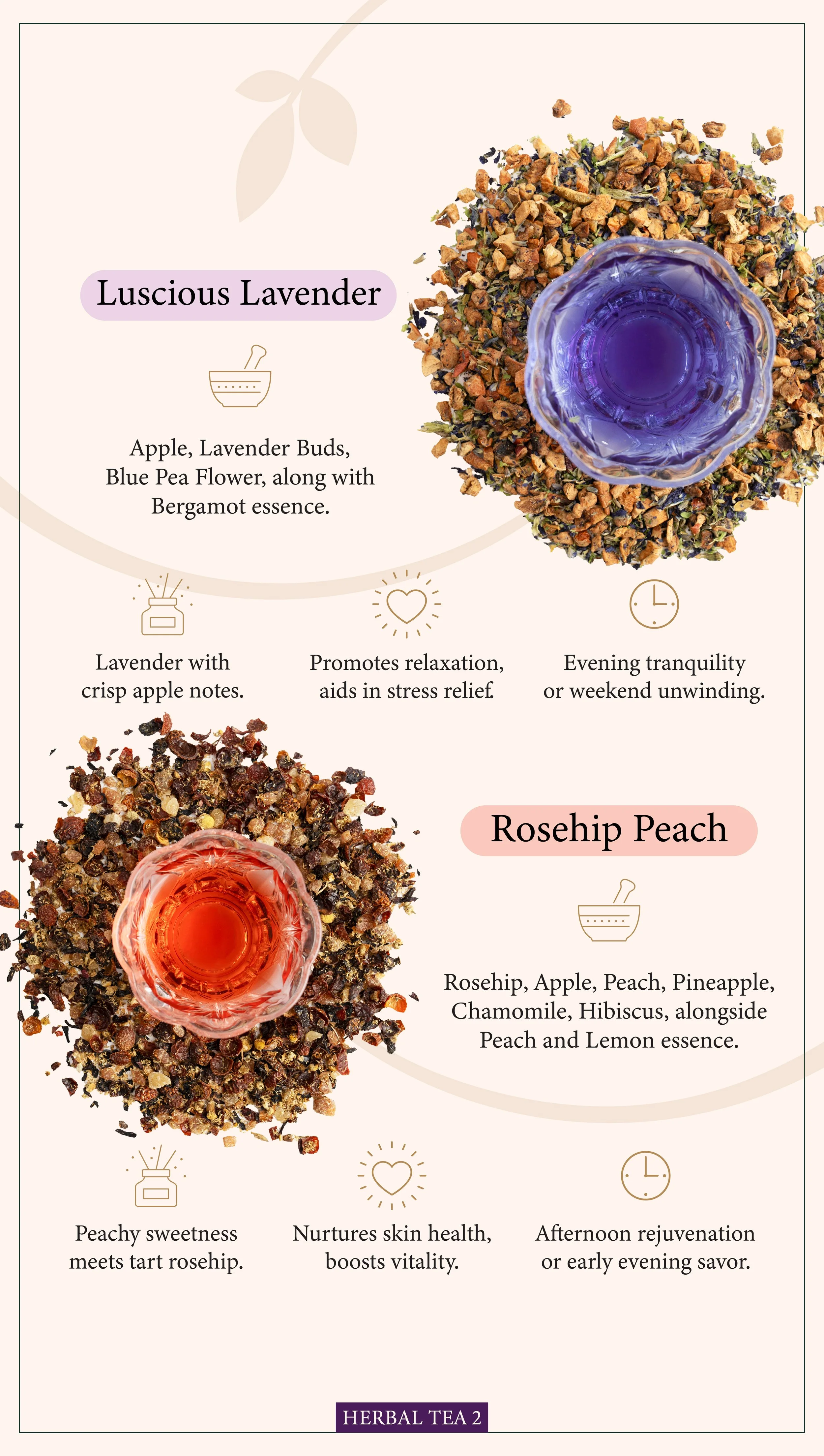
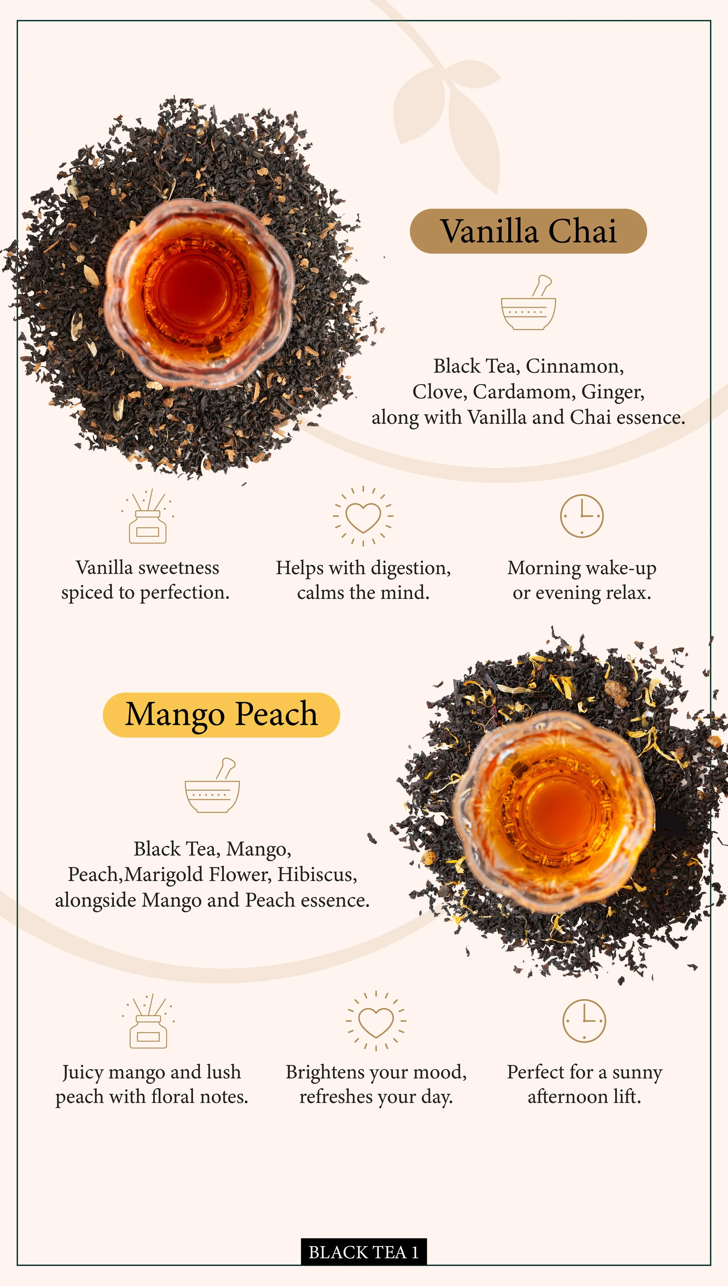
The design was tied closely with nature to represent where the tea came from. There were small details with Sri Lankan tea farmers to symbolize the roots and the appreciation the business had with the teas’ history. The purple color was chosen for the herbal teas, cooler shade of green for black teas, and the bright green was chosen for the green teas. While designing and refining the templates for 26 different flavors - there was a great amount of focus on the minor details - the sky matched the ideal time of day to drink a specific type of tea, the river also matched the color of the tea (as seen through a few examples in the pictures below) to give the consumer a hint of what was to come; therefore, building anticipation and excitement and posed as an effective way for the consumer to interact with the product and packaging.
Herbal Tea -
Black Tea -
Green Tea -

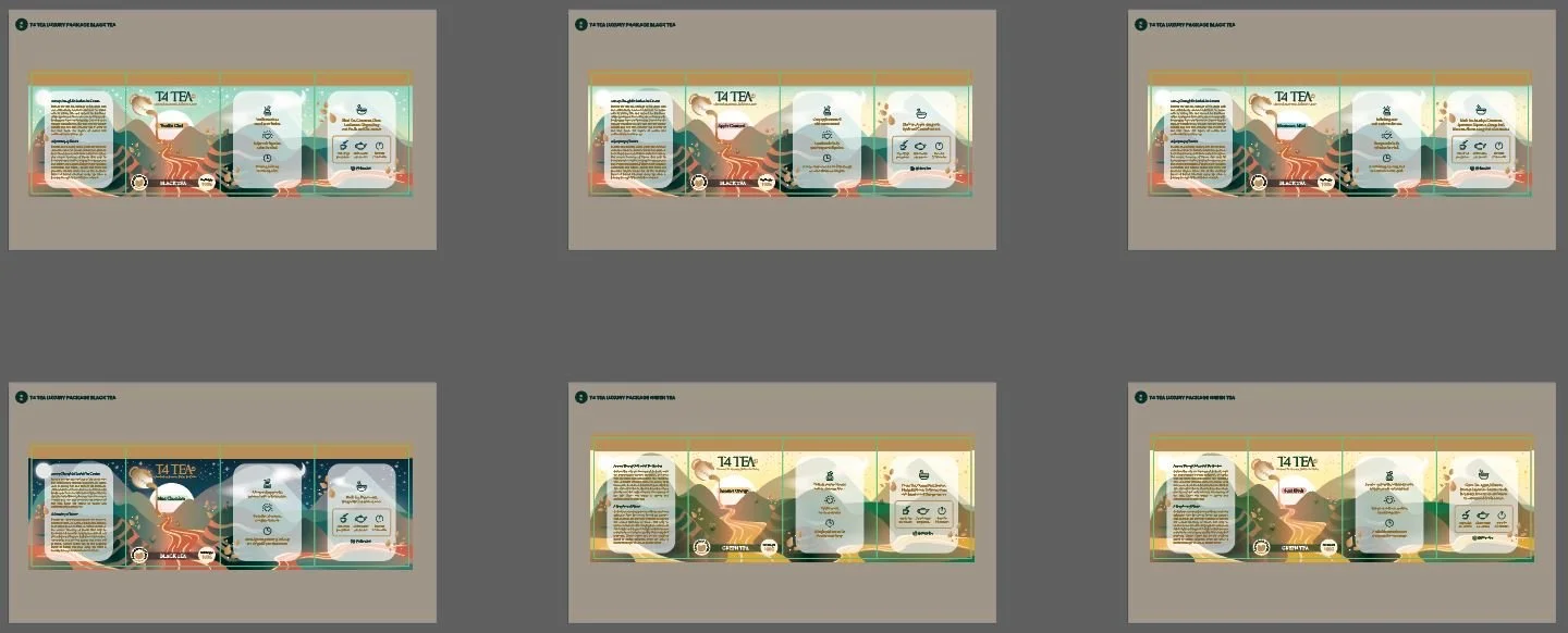
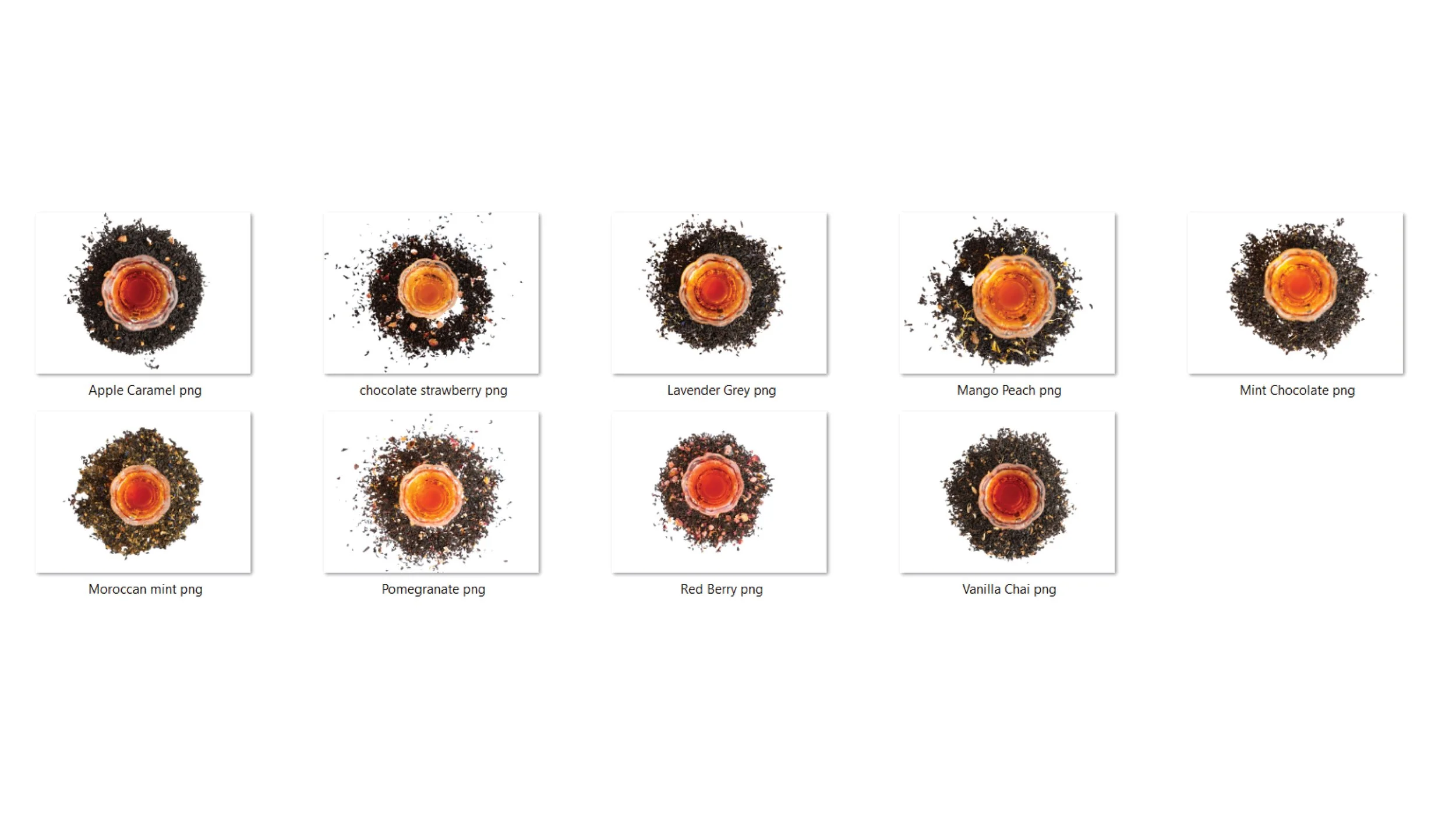
Menu Design (Instagram Highlights + Physical Version) -
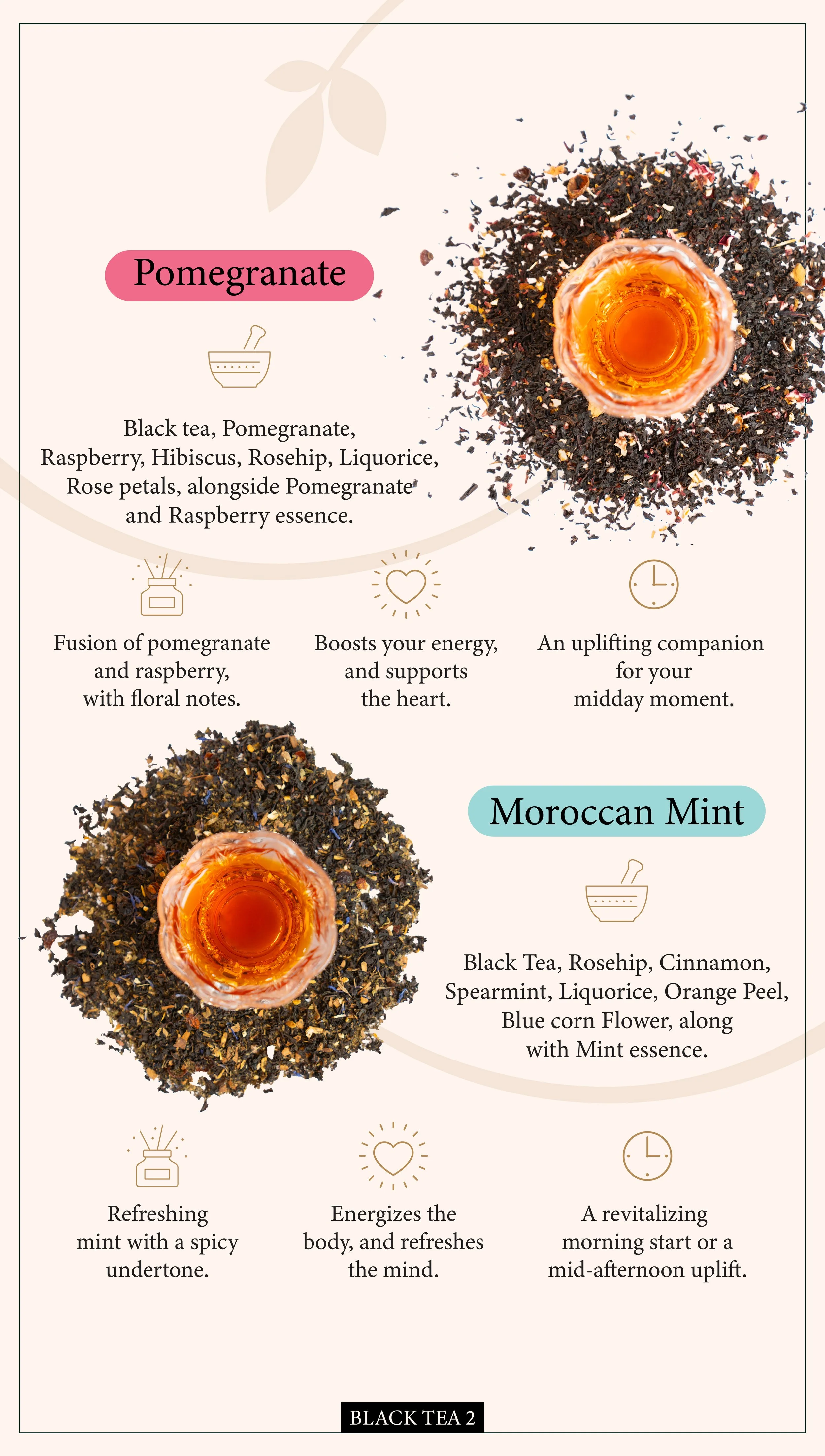
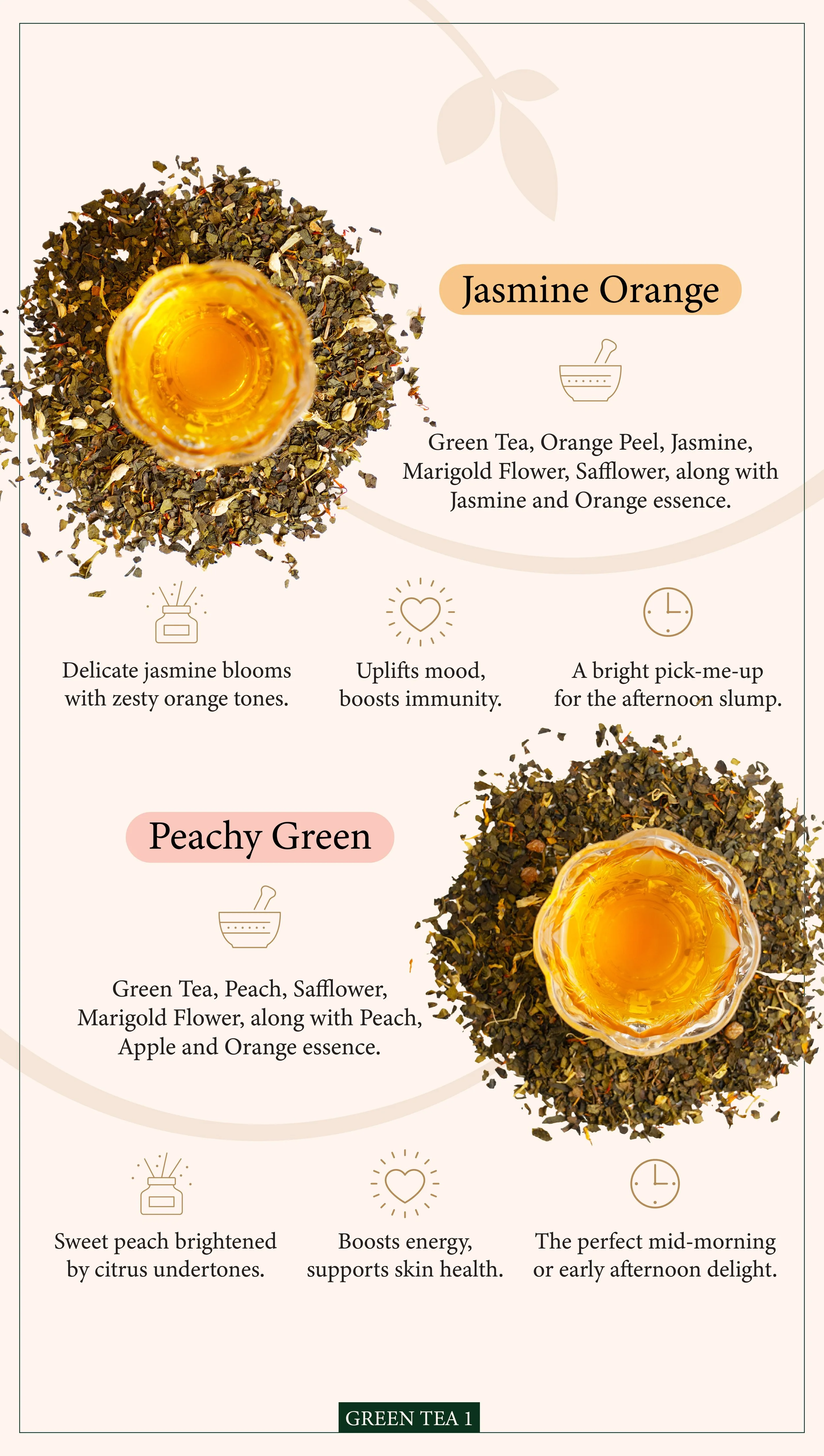
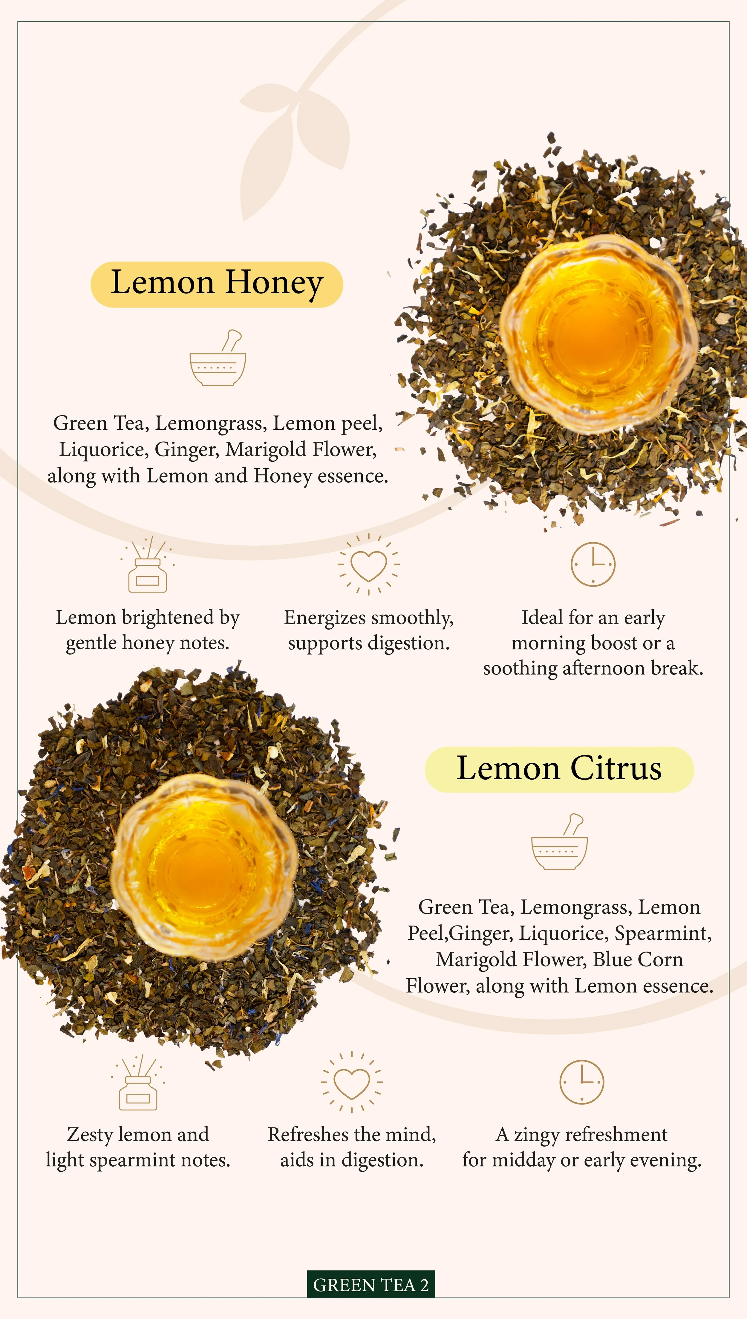
A few pages from the menu have been presented above. The process started with editing all the images of the tea and removing the background along with any imperfections. The tea is showcased with the leaves so the consumer can see what they will be purchasing. The structure of the pages were set through a process of brainstorming and the information was summarized to help the important information of the teas to be presented and allow the consumer digest it effectively. Each category of the tea is divided with a page highlighting what type of teas will be coming next and the pages are numbered according to the category. The dimensions of the above pictures are for Instagram highlights so the consumers have quick access to the information; the dimensions for the physical menu were changed accordingly. The consistent use of brand colors, logo and patterns allow the menu to create a strong brand identity.