
SAFIYYAH JIFFRY
Personal - Brand Identity
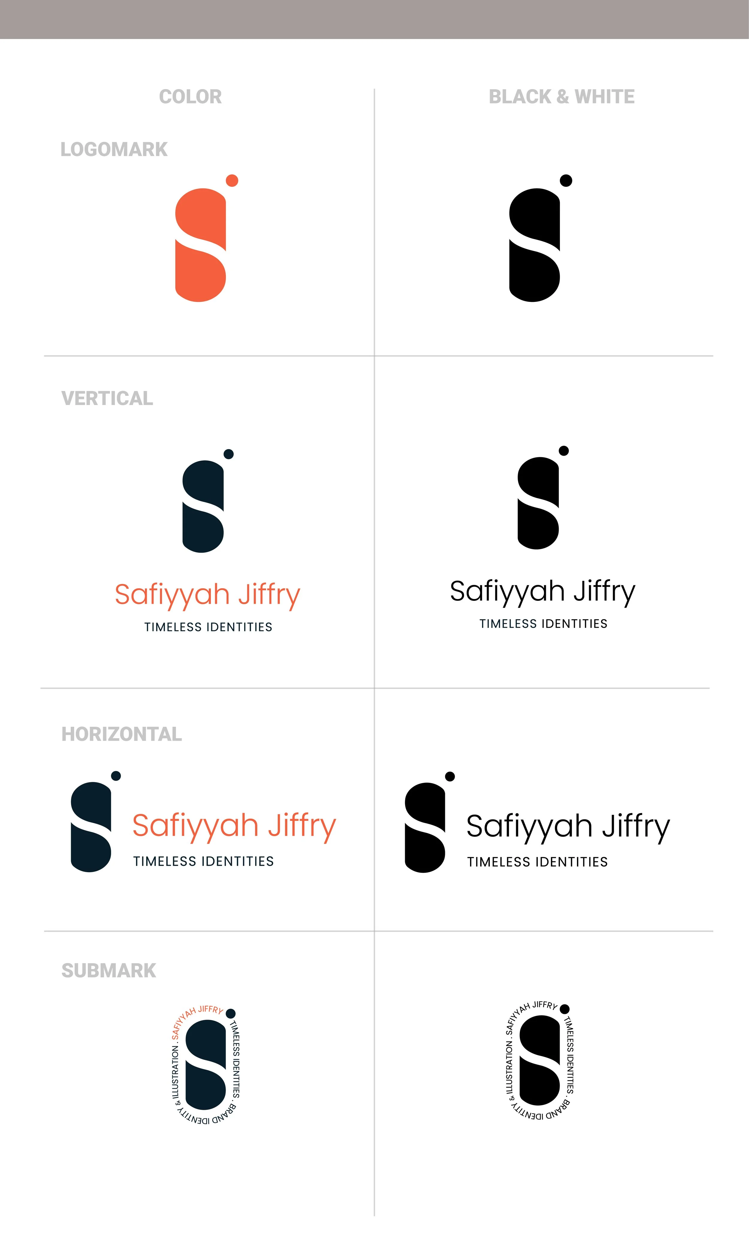
Logo creation process

Color Palette

Logo and Variations
Font
Poppins
Acumin Pro
Brand Elements
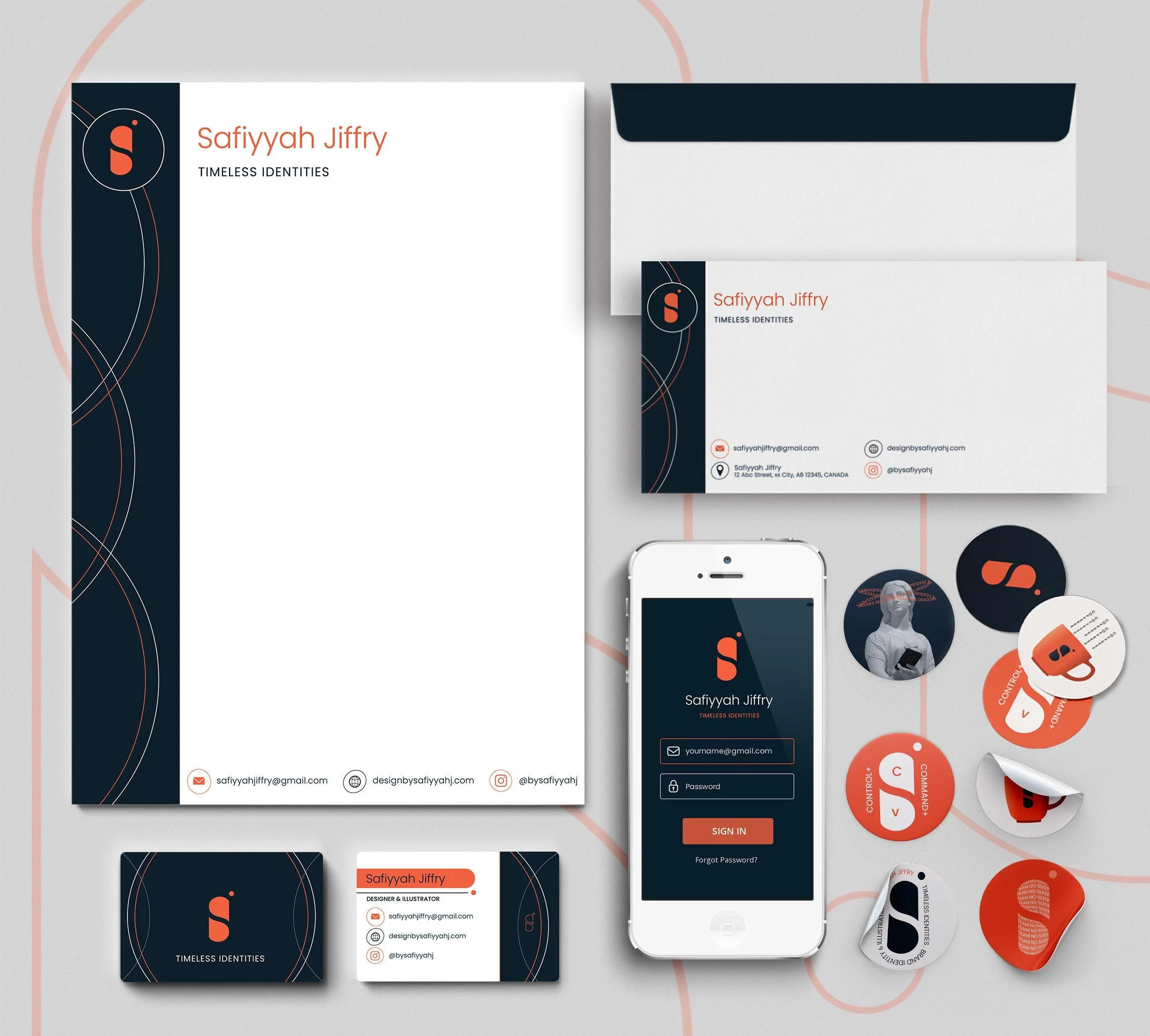
Stationery - Business Card, Letterhead, & Envelope
Digital Application - App
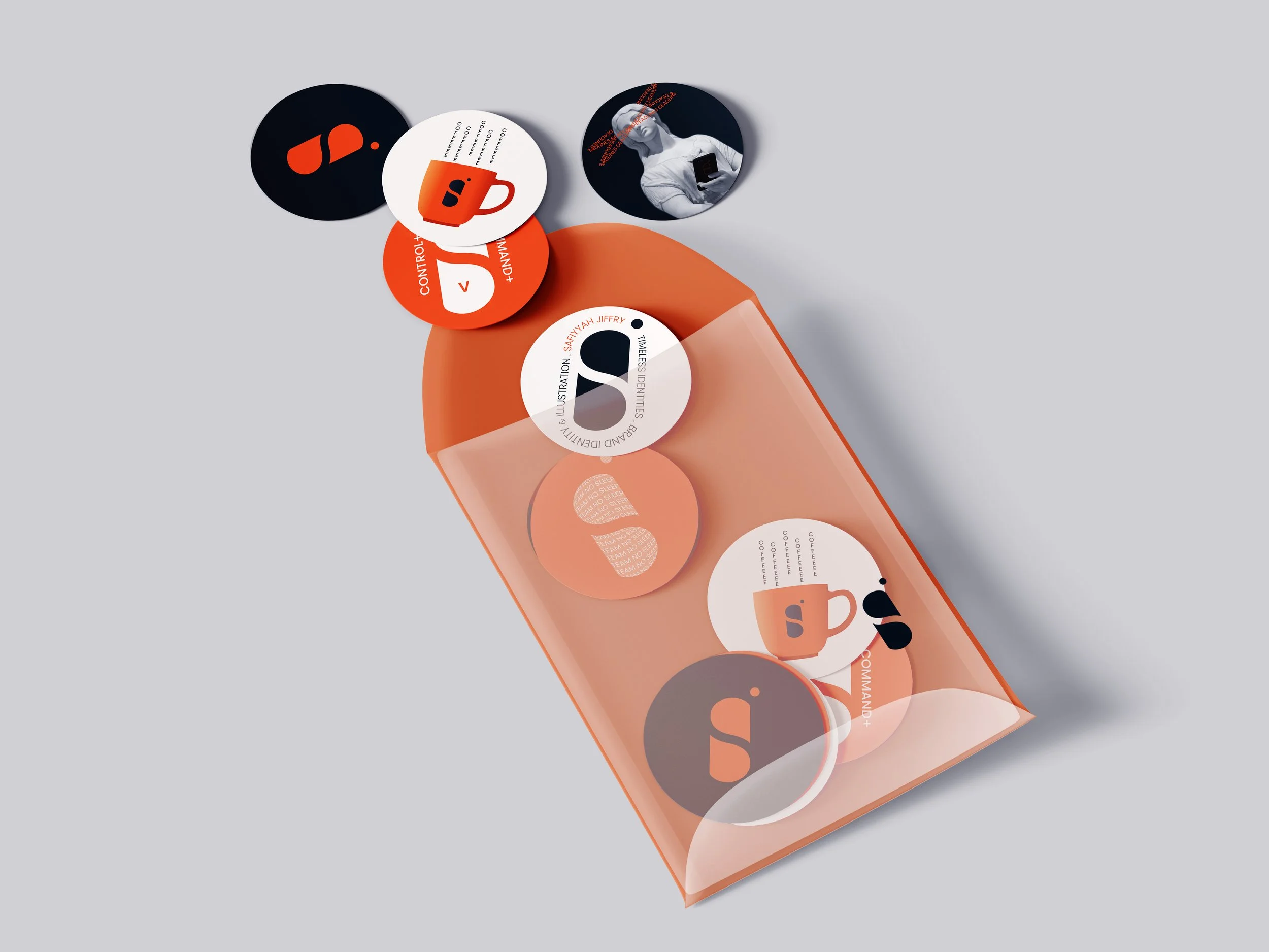
Leave behind piece - Stickers
Rationale
The logo uses three shapes and negative space to shape the letters S and J. It is scalable and easy to remember. I have used high contrasting colors like orange, midnight blue and lighter colors like cream and faded grey. The colors and logo give the brand a professional, modern, and clean look.
I decided to design stickers for my leave behind piece; stickers are fun to use and people of all ages like them; they will also be appealing to people who like that content and will stick them around the walls, or notebooks or their computers so it is a good and fun way to promote and bring awareness to my design business. I have made sure that the stickers don’t have any inappropriate images, wordings and negative connotations so that it isn’t offensive to other cultures and are suitable for all audiences.
I have used the same colors, logo and variations, and patterns throughout the brand elements so that it looks cohesive and can be identified as one brand. Hierarchy, scale, contrast, and space are utilized to make sure the elements in the design are easy to identify, legible, looks professional and of high quality.